Quantcast
Channel: The Pencilcase Blog | Fountain pen, Pencil, Ink and Paper reviews
Viewing all 419 articles
Browse latest View live

REVIEW: WANCHER PRIMO FOUNTAIN PEN

$
0
0
REVIEW: WANCHER PRIMO FOUNTAIN PEN

I'd like to say the Wancher Primo is a strange, unusual pen that I didn't see coming whatsoever. But then again, Wancher has never shied away from trying new things and stepping out of their comfort zone - like competitively priced Urushi with the Dream Pen (reviewed HERE), or the unique bakelite (!) Seven Treasures fountain pens (reviewed HERE). The Japanese brand has also dabbled in creating a titanium pen before (with the Dream Pen Ti), but it never seemed to have taken off (possibly due to the high price). 

With the Primo, however, they've approached the concept of a titanium pen from a very different angle. And while I don't love all aspects about it, Wancher did manage to incorporate quite a few very creative and original ideas! 

REVIEW: WANCHER PRIMO FOUNTAIN PEN

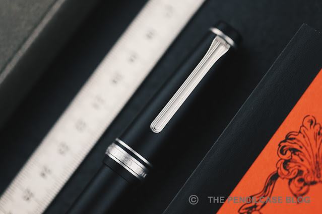
Take it out of the beautiful traditional Japanese wooden box, and the Primo immediately catches the eye with its minimal, quite futuristic, cylindrical shape, and prominent finials in contrasting material. The main highlight is the titanium cap and barrel, which have been sandblast-etched to create a random 'splattered' texture, and then anodized in different colors (Midnight BlueFrosty SilverRusset Brown, and Amethyst Purple). 

REVIEW: WANCHER PRIMO FOUNTAIN PEN
There's a subtle, but very pleasant tactility to the surface finish on the cap and barrel

The texture is unlike anything I've ever seen before. I really like how it creates a visual, as well as tactile, contrast between matte and polished surfaces.

REVIEW: WANCHER PRIMO FOUNTAIN PEN

But there are also things about the Primo I don't understand - And that starts with the finials. Designwise, I'm not fully on board with how the extremely large and prominent finials look. On the Frosty Silver version, the raw aluminum finials blend in relatively well with the titanium parts for a more understated look. On the other colorways, the raw aluminum finials make the Primo look sort of like a clunky magic wand -an asymmetrical one, at that- but that's of course down to personal taste.

Design reasons aside, the construction of the finials leaves me scratching my head. You see, the Primo is a very stately, bulky pen. It's also quite heavy (48 grams total). The aluminum section and finials are supposed to help reduce weight, but instead they made the finials so large and solid (they're barely hollowed out on the inside) that they actually increase the weight! This makes for a pen that's very noticeably balanced towards the finials, and well... not really all that light. 

REVIEW: WANCHER PRIMO FOUNTAIN PEN

The fact that the finials are so solid on the inside, also means they sort of get in the way of the nib and converter when closing the cap and barrel, respectively. It happens frequently that the nib will catch on the inside of the cap because of this. 

That also means there was no space left for a spring-loaded airtight inner cap, despite Wancher equipping most of their other pens with this handy feature. The cap seals off pretty well on its own, but the nib does seem to dry out a bit over extended periods of time, more so than other Wancher pens that do have the inner cap.

REVIEW: WANCHER PRIMO FOUNTAIN PEN
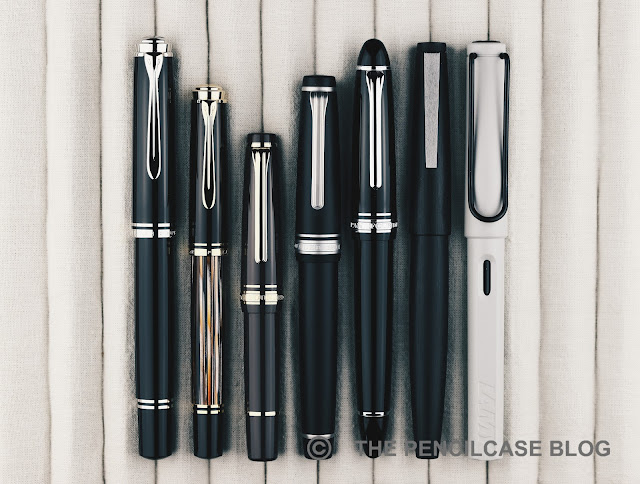
L to R: Gravitas fountain pen, Ensso Piuma, Wancher Dream Pen, Wancher Primo, Pelikan M805, Lamy 2000, Lamy Safari

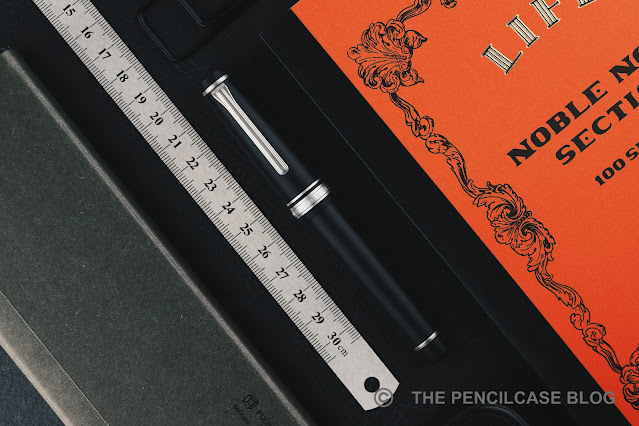
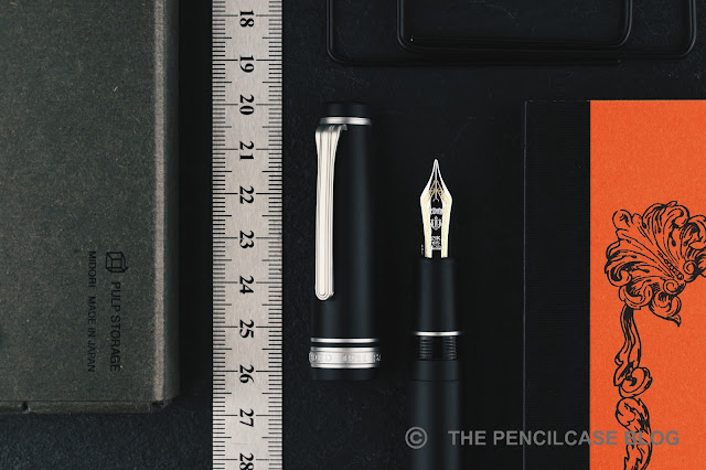
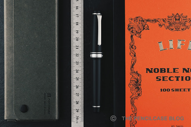
Wancher doesn't scare away from making quite oversized pens, and the Primo illustrates that quite well. Measuring 14.7 cm (5.79") capped, and 13.6 cm (5.35") uncapped, it certainly isn't small to begin with, yet it's not quite as big as Wancher's own Dream Pen, for example. With the Primo, it's mainly the constant, wide diameter of 1.6 cm (0.63") across the entire pen, that really creates the oversized impression.

REVIEW: WANCHER PRIMO FOUNTAIN PEN

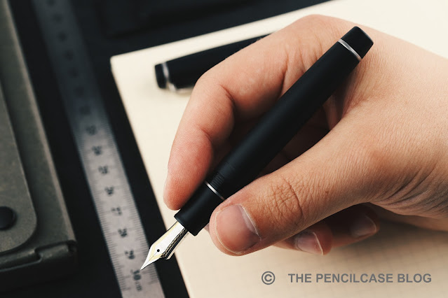
Going from the very wide barrel, there's a rather large step towards the metal section, which has a diameter of just 1.1 cm (0.43"). The section tapers down further to 1 cm (0.39"), with a short flared section at the end. The design of the section is almost entirely taken over from the Dream Pen (reviewed HERE), which means they deal quite well with the large step. The diameter gradually increases, first up to the threads, then a beveled ring, and finally the rounded edge of the barrel. 

There's one small -but important- detail the Primo didn't take over from the section design of the Dream Pen: the threads! Unfortunately, they took a step back towards traditional, v-cut threads, instead of the more comfortable and precise block threads from the Dream Pen. The threads are quite deep, which makes them especially noticeably if you hold your fingers on them. Despite the section being quite a decent, comfortable size, it's not always possible to avoid the sharp threads in your grip. 

REVIEW: WANCHER PRIMO FOUNTAIN PEN

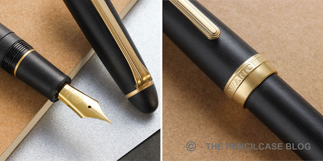
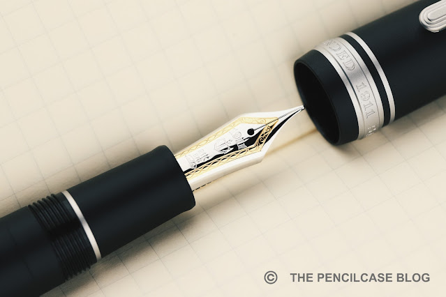
The Primo comes equipped with a steel Jowo nib, but it did receive some (optional) upgrades to make it a bit less 'stock' in terms of looks and performance! First of all, the nibs are color-matched to the color of the pen itself. The plating treatment creates a somewhat pearlescent hue on the blue, purple, and brown nibs. The nib on the Frosty Silver Primo received matching rhodium plating instead of the bare stainless steel finish, which creates a brighter and more lustrous look.

Second are the optional ebonite feeds which, as I understand it, are still manufactured by Flexible Nib Factory. Although the two samples I was sent, both came with JoWo's stock plastic feeds, I've reviewed a couple of Wancher's Dream Pens with the ebonite feeds before, and they're a great addition to the already reliable writing experience JoWo nibs offer. You can't really go wrong with any of the feed options, but the ebonite feed (+30$ for black ebonite, +50$ for red ebonite) does give you a noticeably richer ink flow.

REVIEW: WANCHER PRIMO FOUNTAIN PEN

It's hard to put a final verdict on the Wancher Primo. The Wancher Primo retails for 250$, which is quite steep, especially once you factor in paying an additional 30 to 50 dollars for an ebonite feed. 

On one hand, considering the price point of the Primo, I feel like there are a few elements (mainly the clunky finial design and the sharp threads) where I feel like Wancher could've done a better job. On the other hand, I do think Wancher absolutely succeeded at creating a unique pen, one that easily catches the eye. Things like the textured barrel and cap, and the color-matched nibs, are perfectly executed and set this pen apart on the market. But on the other hand, I can't help but feel like Wancher missed the ball on a few particular design decisio

NOTE: This product was provided by Wancher, so I could write this review. I was in no way influenced in the making of this review, the opinions shared in this review are completely my own. This post does not contain affiliate links.

REVIEW: WANCHER PRIMO FOUNTAIN PEN


ACCESSORIES FOR THE DESK: MAKERS CABINET HØVEL & IRIS REVIEW

$
0
0

ACCESSORIES FOR THE DESK: MAKERS CABINET HØVEL PENCIL SHARPENER & IRIS COMPASS REVIEW

As with so many hobbies, most things within the writing community aren't about making sensible financial decisions. Let's be honest, it's quite easy to be tempted into buying (ahem, hoarding) all kinds of pens, pencils, desk accessories, and gadgets that nobody really needs... but everybody wants! The two desk accessories by Makers Cabinet we'll be looking at, certainly categorize as such. I can't help but be quite enamored by these nifty tools. 

UK-based Makers Cabinet hit the market somewhere in 2017 (then as 'Brahman Design') and was started by three product design graduates. Aesthetics is the name of the game with Makers Cabinet. You'd think 'form follows function' is out of the door then, but after using the Makers Cabinet Høvel pencil sharpener and Iris compass, the meticulous attention to detail quickly becomes clear.

As aesthetics are a big part of the appeal of the Høvel and Iris, so let's start there...

ACCESSORIES FOR THE DESK: MAKERS CABINET HØVEL PENCIL SHARPENER & IRIS COMPASS REVIEW

One key element returns throughout the entire product catalog of Makers Cabinet: all of their products are made out of brass! But as much as that ties together their different products, each item still very much brings its own unique look and feel. 

The Hovel - a very minimal, miniature interpretation of a wood planer - is a slick and sleek chunk of brass, with rounded edges and a highly polished finish. The rectangular cutout that houses the blade setup received a lightly sandblasted finish for a subtle contrast, it also has the 'Høvel' logo laser-engraved there.

ACCESSORIES FOR THE DESK: MAKERS CABINET HØVEL PENCIL SHARPENER & IRIS COMPASS REVIEW

The Iris - a brilliantly overengineered take on the classic circle drawing compass - is quite the opposite in terms of design. Its crisp beveled edges, knurling, and mixture of finishes (machined finish, brushed, and sandblasted) interweave to create a distinctly industrial look and feel. One thing I noticed while using both products, is that the type of brass they use isn't very prone to tarnishing (even though it's not coated), I'm still waiting for the Høvel and Iris to take on a nice vintage appearance. 

ACCESSORIES FOR THE DESK: MAKERS CABINET HØVEL PENCIL SHARPENER & IRIS COMPASS REVIEW
The 'Makers Cabinet' and 'Iris' branding only appears when you close the blades of the Iris!

The solid brass construction creates a wonderfully hefty tactile appearance. So much so, that I'm constantly tempted to play with the Høvel as a worry stone... if it wasn't for the blade sticking out of the bottom (not quite so practical as a fidget toy!).

ACCESSORIES FOR THE DESK: MAKERS CABINET HØVEL PENCIL SHARPENER & IRIS COMPASS REVIEW

No, neither Iris nor Høvel are cheap products by any stretch of the imagination, but it has to be said that the production quality on both is really, really impressive. Machining is precise, assembly and fit and finish is flawless, finishing is cleanly done. I have no remarks, it's as simple as that. 

Especially on the Iris - a rather complex mechanical construction with a lot of moving metal parts - it's extra impressive how everything fits together perfectly and the diaphragm slides open and closed buttery smooth. The only remark I could make is that stainless steel diaphragm blades of the Iris do pick up scuffs from sliding over each other, but that's to be expected with these moving parts.

Let's move on to functionality, because yes, you really are getting more than just a good-looking paperweight for your money!

ACCESSORIES FOR THE DESK: MAKERS CABINET HØVEL PENCIL SHARPENER & IRIS COMPASS REVIEW
It doesn't take much practice to get nice and clean sharpening results.

Starting with the Høvel; it has been mocked in the past for its very concept: a plane for a pencil sharpener, why even?!? I must say, I was skeptical as well, and my view aligned with some reviews that stated it's awkward and unnecessarily difficult to use.

Though as soon as I started testing the Høvel myself, I found it surprisingly easy and intuitive to use. That does come with a slight sidenote that I often sharpen pencils with a pocket knife (I'm weird like that), so I do have some practice with unconventional sharpening techniques (that's undoubtedly my weirdest flex ever!). The alignment of the blade - just a millimeter below the plane surface - allows thin curls of wood to be shaved off using minimal pressure. With some practice, you can get straight and clean cuts and even make a nicely symmetrical point onto your pencil. 

The Høvel, just like a knife, gives you more freedom in varying the angle and shape of the pencil tip entirely to your liking, and it can also be used for oddly sized and shaped pencils that don't fit a traditional sharpener. The Høvel comes with a cute tiny package of 10 blades, which is more than enough to keep you sharpening for a while. 

ACCESSORIES FOR THE DESK: MAKERS CABINET HØVEL PENCIL SHARPENER & IRIS COMPASS REVIEW

One remark I have with the Høvel is that you have to hold it sort of precariously at the very edge to keep your fingers out of the way of your pencil, and the mirror-polished finish is quite slippery. Perhaps it would be useful if they'd add some knurling or texture to the sides of the Høvel. Maybe an idea for a future iteration? 

ACCESSORIES FOR THE DESK: MAKERS CABINET HØVEL PENCIL SHARPENER & IRIS COMPASS REVIEW

The Iris is probably my favorite of the two tools, and that's mostly due to the incredibly smooth and precise action of the 20-blade diaphragm opening and closing by turning the outer ring. It's very satisfying to play with! 

ACCESSORIES FOR THE DESK: MAKERS CABINET HØVEL PENCIL SHARPENER & IRIS COMPASS REVIEW

The centimeter scale on the outer edge enables you to precisely draw circles with a defined diameter, or measure them. Talking about that scale: I of course tested the accuracy, and it's accurate down to a millimeter or so. One slight caveat is that, even though the diaphragm has a lot of rounded blades, you always get a subtly 20-sided circle, not a perfectly round one. At some circle diameters it's more noticeable than others, though (circles above 5 cm appear perfectly round). With that said, I'd say the Iris is still perfectly suitable for drawing, sketching, or doodling. Anything but precise technical drawing. 

ACCESSORIES FOR THE DESK: MAKERS CABINET HØVEL PENCIL SHARPENER & IRIS COMPASS REVIEW

The rubber padding on the underside of the Iris keeps it firmly in place on the paper, which is necessary as the twist mechanism does require a fair bit of force to operate. 

ACCESSORIES FOR THE DESK: MAKERS CABINET HØVEL PENCIL SHARPENER & IRIS COMPASS REVIEW
The Høvel can also be placed upside-down in the wooden base and used as such

One more thing... Both the Iris and Høvel have a purpose-built walnut wooden base. With the Iris, it's included in the box (and doubles as a center-point finder when you place it within the Iris). The base for the Høvel, unfortunately, isn't included and adds an additional 14$ to the cost of the pencil plane. Frankly, I think the base for the Høvel should also be included in the price, as you miss out on a lot of functionality without it. For one, it protects the blade (and also your desk!) when not in use, but it also doubles as a pencil shavings tray, and a holder to place the Høvel upside down to sharpen your pencil with the Høvel on the table  (although I personally find it easier to use handheld). 

ACCESSORIES FOR THE DESK: MAKERS CABINET HØVEL PENCIL SHARPENER & IRIS COMPASS REVIEW

If price is no object, and you want something unique on your desk - certainly a conversation piece -, the Makers Cabinet Høvel (69€/ 80$) and Iris (120€/ 138$) are two tools (because despite the beautiful and unique design, that's still what they are) that are definitely worth checking out. Build quality is second to none, and I'm sure the Stria ruler and upcoming pencil extender 'Ferrule' will hold to the same high-quality benchmark Makers Cabinet has set for themselves. 

Better yet - with the upcoming Holiday season in mind - both the Iris and Høvel could make for ideal gifts for the design-minded writing or drawing enthusiasts that already have all the other essentials covered on their desk!

NOTE: These products were provided by Makers Cabinet, so I could write this review. I was in no way influenced in the making of this review, the opinions shared in this review are completely my own. This post does not contain affiliate links.

ACCESSORIES FOR THE DESK: MAKERS CABINET HØVEL PENCIL SHARPENER & IRIS COMPASS REVIEW

REVIEW: NEW PARKER 51 FOUNTAIN PEN

$
0
0
REVIEW: NEW (MODERN) PARKER 51 FOUNTAIN PEN
As expected, the reintroduction of the Parker 51 caused quite a stir within the community. It took me quite a while to get my thoughts about it in line, but I think -perhaps somewhat unexpectedly- my overall impression of the new version is quite a bit more positive than you might expect. I actually think it's a pretty successful hommage to the original in many (not all) ways. This modern version is more than capable of holding its own, and I think it was to be expected that it wouldn't just be a carbon copy of the vintage model. In fact, I'd even go out on a limb and say that I really like and even prefer some of the changes Parker made in the modern version. 
REVIEW: NEW (MODERN) PARKER 51 FOUNTAIN PEN
L to R: Vintage P51 gold-filled, modern P51 Deluxe, Vintage P51 'Lustraloy', modern P51
Designwise, Parker stayed pretty true to the original. Between the standard version with brushed steel cap, and the 'Deluxe' with gold-plated details, the designs perfectly mimic the two vintage P51 (both aerometrics) I own: one with guilloche gold-filled cap and one with the 'Lustraloy' brushed steel cap. Especially from afar, you'd be forgiven for not being able to distinguish between the old and new. 
REVIEW: NEW (MODERN) PARKER 51 FOUNTAIN PEN
Modern Parker 51 on the left, the slightly shorter vintage P51 on the right.
There are some things that give it away, though: the dimensions didn't change too much, but the new 51 did get ever so slightly longer. The barrel takes up all of that extra length, creating a different cap-to-body ratio. This longer barrel gives the impression of a much larger pen, even though in reality it's not that big of a difference. 

The second dead-giveaway is the clip, which is now the more modern arrow interpretation that Parker uses on most of their current pens. I have to admit it's not as nice as the vintage arrow, and I find that the vintage-inspired design of the 51 would've warranted an equally vintage-inspired clip to go along with it. 
REVIEW: NEW (MODERN) PARKER 51 FOUNTAIN PEN
One of the major differences between the original and new 51 is the switch towards a threaded cap. Called almost a blasphemy by some, I actually think it's an improvement over the original. At least in the condition that original vintage P51's are in at this point -often well-used throughout the years- I'm not a particularly big fan of how the clutch-style cap works. On both my vintage pens, the cap feels mushy and it's hard to tell if it clicked on properly or not. The screw-cap at least leaves that guessing work out of the equation, and you can be certain that it's always on securely. No risk of accidental uncapping and an inky mess. As an aesthetic nod to the original design, a metal ring just below the threads mimics the original clutch ring of the vintage 51. 
REVIEW: NEW (MODERN) PARKER 51 FOUNTAIN PEN
A vintage P51 on the left and the modern version on the right
Despite the cap finial of the modern P51 really just being a single part, the stepped shape and 'jewel' insert somewhat recreates the look of the vintage. More precisely, it's inspired by the first generations of the Parker 51. The metal 'jewel' finial is actually surprisingly historically correct, as the very first P51's came with an aluminum jewe! 
REVIEW: NEW (MODERN) PARKER 51 FOUNTAIN PEN
L to R: Parker IM, vintage Parker 51, modern P51, modern P51 deluxe, Pelikan M805, Lamy 2000, Lamy Safari
Of course the original Parker 51 -as with many vintage pens- isn't a terribly large pen. The modern 51 measures 14 cm (5.51") when capped, which is about 4 mm longer than the vintage. 
REVIEW: NEW (MODERN) PARKER 51 FOUNTAIN PEN
When uncapped, the modern Parker 51 (Left) is a bit shorter than its vintage counterpart!
Surprisingly, the roles are reversed when uncapped: here, the modern P51 is 4 mm shorter, coming in at just 12,3 cm (4.84"). Though of course, the hooded nib allows you to grip the P51 much closer towards the front, so it remains usable unposted. For those that do like a slightly longer pen, just like its vintage counterpart, the new P51 posts very securely and balanced. The modern P51 has a comfortable section diameter around 10 mm where you hold it, but it is of course still a rather skinny pen for modern standards. The entire pen is lightweight, coming in at around 20 grams total. 
REVIEW: NEW (MODERN) PARKER 51 FOUNTAIN PEN
Top: the modern P51 takes a regular Parker converter, Bottom: a vintage P51 aerometric captured converter.
The c/c filling system was obviously to be expected. Parker hasn't been doing aerometric-style (or for that matter, Vacumatic pump-filler) mechanisms for years at this point. As their brand name positions them in the market to cater towards a wide audience, not just the die-hard enthusiasts, it makes sense that they put their money on c/c filling systems. Not that I think cartridges or converters should be seen as a lesser option, as they remain a very accessible and practical option for everyday use. 

What I DO find a really bad oversight on Parker's end, is that a pen this price really should come with a converter included in the box. As it stands now, only the Deluxe version gets one as standard. There's really no excuse for not including a converter with a 90€ pen, and then charging a ridiculous 8 to 10 extra euros for one. Rant over.
REVIEW: NEW (MODERN) PARKER 51 FOUNTAIN PEN
The nib, then. From what I can tell, it does indeed look like the nibs are Parker's standard semi-tubular nibs (and feeds) that were used in the previous iterations of the IM, Vector, Jotter, and some other sub-100$ models. But precisely what nib is being used doesn't really matter that much to me, what matters is how it performs. 
REVIEW: NEW (MODERN) PARKER 51 FOUNTAIN PEN
Despite some people's criticism of the new nib not being true to the original design (Left), I don't think the old and new are that dissimilar from a visual perspective. Only the shape of the hood is slightly less pointy on the modern version (Right).
The steel-nibbed standard version is a capable writer, but nothing particular to write home about. It's a stiff nib with a noticeable amount of feedback (though not scratchy). It's a very responsive writer, despite the tipping seemingly having a slight bit of baby's bottom. The gold-nibbed Deluxe version is a slightly different beast though. Despite both test pens having medium nibs, the 18k gold nib writes at least a solid half size wider than the steel one - the steel nib being more true to a western medium IMHO. The gold nib remains stiff due to the hooded construction, but you can still feel the slight softness in the gold alloy despite not getting any line variation out of it. The gold nib is also noticeably smoother, with a more subtle hint of feedback. Where the steel nib is reliable but a bit bland, the gold nib on the Deluxe is much more interesting to write with and even has a slightly stubby tipping shape that offers some line variation.
REVIEW: NEW (MODERN) PARKER 51 FOUNTAIN PEN
What I did find particularly noticeable, and even a bit bothersome is that both nibs seem to have a particularly fussy and narrow sweet spot in how you rotate the nib. And that effect seems to be magnified by the fact that the hooded nib sort of obstructs your view. So it is sometimes tricky to see the orientation of the nib properly. 

The caps have some interesting air holes embedded in the cap finials, but those don't seem to negatively affect the nib drying out all that much. While you can find a slight hard start from time to time, it never really dries out over longer periods of time, and usually starts right up again. 
REVIEW: NEW (MODERN) PARKER 51 FOUNTAIN PEN
The new Parker 51 comes in at 90€ (around 100$), which is a fair price but as I said it should come with a converter included. The gold-nibbed Parker 51 Deluxe goes for 259€, which is a substantial premium for a gold nib and a slightly more elaborately finished cap. However, the 18k nib does add a lot to the writing experience. My gut feeling says that the Deluxe version would be a better deal around the 200€ mark, where it could compete with the Lamy 2000 as a more classic-styled alternative. 

This product was sent to me by Parker so I could write this review. I was in no way influenced in the making of this review, the opinions shared in this review are completely my own! This post does not contain affiliate links.

REVIEW: ONOTO MAGNA SEQUOYAH FOUNTAIN PEN

$
0
0
REVIEW: ONOTO MAGNA SEQUOYAH FOUNTAIN PEN
Oh boy, have I been eyeing Onoto pens for a loooong time, before finally pulling the trigger on this Onoto Magna Sequoyah LE last year! I'm kicking myself for not getting one sooner because these pens are everything they're hyped up to be, and then some... Although 'hype' is perhaps not the right word to use with Onoto, because they actually seem quite underrepresented within our community. As with other UK-based brands -like Conway Stewart or Yard-O-Led- Onoto seems to live somewhat in the shadows of the 'traditional' German, Italian or Japanese companies. It's anyone's guess as to why that is. But one thing is for sure, it definitely has nothing to do with the quality of their products, because Onoto certainly delivers in that regard!
REVIEW: ONOTO MAGNA SEQUOYAH FOUNTAIN PEN
Perhaps not coincidental, those three UK-based brands mentioned above have one thing in common: they all embody -what I'd consider- traditional British fountain pen design. Perhaps this more classic and conservative approach to fountain pen design might explain why they aren't more prominently represented on the market? But of course, that's down to personal taste. I, for one, really appreciate the display of Onoto's heritage within their products. 
REVIEW: ONOTO MAGNA SEQUOYAH FOUNTAIN PEN
I love the stylized, modern-looking Onoto monogram in the sterling silver cap finial!
Talking about heritage: the Onoto Magna takes quite accurately after its vintage relative namesake. It's a fairly straightforward and simple flattop design, accentuated by sterling silver appointments. Like most other British brands, Onoto proudly displays their heritage and experience with sterling silver manufacture, which shines through -literally- on the precise details of the trim found on this pen. Every metal piece is made of silver: cap and barrel finials, the three cap rings, and a sterling silver clip with a raised chevron pattern. The silver appointments add a level of intricacy to the Magna's design, but are tastefully done and don't distract from the beautiful material this pen is made of.
REVIEW: ONOTO MAGNA SEQUOYAH FOUNTAIN PEN
While there's a myriad of choice in finishes for the Onoto Magna -from subtle and traditional solid color acrylics, to more colorful materials and even guilloché-engraved finishes-, for me this limited edition (200 pieces) 'Sequoyah' finish stands out as one of the most spectacular and eye-catching of them all. This was the pen I knew I had to have, from the moment I first laid eyes on it! 

The pen is named after a Native American called 'Sequoyah', who established a written form of the Cherokee language. The material of the pen is inspired by the similarly-named Sequoia tree. The woodgrain-like brown acrylic is absolutely sublime. It has a surprising amount of shimmer in the warm, brown swirls, interlaced with dark streaks of solid black resin. The end result is a pen that genuinely looks like it's made from a piece of burlwood. 
REVIEW: ONOTO MAGNA SEQUOYAH FOUNTAIN PEN
The warm tone of the acrylic balances nicely against the sterling silver trims when the pen first arrives. But it doesn't take too long before a strong brown-ish patina (tarnish) begins to develop on the silver. While you can of course polish most of the trims with a jeweler's cloth to bring them back to shiny silver, it's not so easy to do so with the cap finial due to its deep texture and crisp edges. Therefore, it seems to me that the best option is just to let the material do its thing, with the patina bringing a very vintage-esque feeling to the pen.
REVIEW: ONOTO MAGNA SEQUOYAH FOUNTAIN PEN
L to R: Montblanc 149, Conway Stewart Churchill, Onoto Magna Sequoyah, Pelikan M805, Lamy 2000, Lamy Safari
The Magna is an average-to-large pen, measuring 14 cm (5.53") closed - about the size of a Pelikan M800. I suppose the name 'Magna' (great) has more historical meaning than it is relevant on these current-day pens. With an uncapped length of 13.2 cm (5.19") it's a very decent size to use unposted. The cap can post if you really want to, but it makes for a considerably large 16.6 cm (6.54") pen.
REVIEW: ONOTO MAGNA SEQUOYAH FOUNTAIN PEN
Between this one and the few Onotos I briefly tried over the years, I've been consistently impressed with the absolutely impeccable build quality and finishing, as well as the excellent writing comfort they have to offer. The section has a comfortable diameter (12.5mm/ 0.49" at the back) with a straight taper towards the nib (down to 10mm/ 0.4"). The section transitions almost seamlessly into the barrel, where a set of rather shallow threads is the only thing that could possibly obstruct your grip - but it doesn't, because they're so well-finished. 
REVIEW: ONOTO MAGNA SEQUOYAH FOUNTAIN PEN
As a rather unique feature to finetune the writing comfort of the Magna, Onoto offers two weight options for the Magna pens, with an optional brass barrel, insert adding 7 grams to the 25 of the base version. I found my 25-gram version to be perfectly balanced in the hand, and light enough as to not cause any fatigue while writing. That said, because I do tend to lean towards heavier pens, I am curious to try out the 32g option at some point.
REVIEW: ONOTO MAGNA SEQUOYAH FOUNTAIN PEN
The Magna Sequoyah (and other versions of the Magna) fills using a standard international converter. Fine by me, though perhaps a bit plebeian on a pen as nice as this? There was once an option to upgrade to a plunger-filler I thought, but that no longer seems to be the case when I look at the Onoto site.
REVIEW: ONOTO MAGNA SEQUOYAH FOUNTAIN PEN
Another highlight (although if I'm honest, most aspects of this pen are highlights) of the Onoto Magna is the nib. I don't think they produce their own nibs in-house, but whatever they do, they do it right. The #6 (in Onoto numbers it's a #7 size) 18k gold nibs sits on a plastic feed that delivers a rich flow of ink, and it does so with flawless consistency. I went for a fine nib on the Sequoyah, and it's definitely a beefy western fine, so you might want to step down at least a size if you don't like your nibs to run wider. 
REVIEW: ONOTO MAGNA SEQUOYAH FOUNTAIN PEN
The fine nib on my pen is fantastically smooth and perfectly set up out of the box (and from what I can recall, so were the steel and gold nibs I tried in the past). The nib has a slight bit of bounce to it with normal writing pressure, but no real line variation to speak of. Particularly of note is that the nib doesn't seem to dry out, ever. I've had this pen inked up continuously for almost a year now, and there were times when it wasn't used for months, yet it always picked right up. 
REVIEW: ONOTO MAGNA SEQUOYAH FOUNTAIN PEN
I feel like I've been raving about this pen non-stop, but I can't help myself, it's simply THAT good! Nonetheless, to round up this review I did also find a couple minor quirks that are worth noting, though not particularly deal-breaking for me: For starters, the clip is pointy... a bit too pointy! I appreciate the overall shape and design, but the tip could've been rounded off just a bit more to prevent it from feeling sharp to the touch. I also fear it could damage fabrics if you clip it to a pocket a bit too incautiously. The second remark is one I've also read on Anthony's review of the Magna (UKFountainpens): the cap takes almost 3.5 full turns to unscrew. I'm not typically one to complain about this, but more than 3 turns really is quite a lot!
REVIEW: ONOTO MAGNA SEQUOYAH FOUNTAIN PEN
It took me a while, but I'm glad I finally pulled the trigger on an Onoto. The Onoto Magna Sequoyah manages to do so many things right, making for a fantastic all-around package. Beautiful burlwood-like acrylic, stunning sterling silver details, flawless construction, A+ writing comfort, and a perfectly tuned nib out of the box. It ticks all the boxes for me. 

The price of all that? A not-so-unreasonable 640€ (600$ without VAT for non-EU customers,  at La Couronne Du Comte. Use our discount code 'penthusiast' for 10% off!). I think that's a fair and competitive price for the complete package that the Onoto Magna has to offer. Also, note that that is the price for the 18k gold-nibbed version. On the Onoto website, you also have the option for a steel-nibbed version for 430€ (but the gold nib is where it's at, if you ask me!).
https://www.lacouronneducomte.com/
Note: La Couronne Du Comte is a sponsor of this site. I received a discount on this purchase, which enabled me to write this review. I was in no way influenced in the making of this review, the opinions shared in this review are completely my own! This post does not contain affiliate links.
REVIEW: ONOTO MAGNA SEQUOYAH FOUNTAIN PEN

SPRING CLEANING PEN SALE!

$
0
0

The days are getting longer. Frost and darkness are starting to make place for the first rays of sunshine as spring closes in. 

And I? Well, I've been a bit absent on here (as you may have noticed!). I've started the new year by rethinking some priorities. While I'm certainly not giving up on pens, nor this website, I do feel like I want to explore a bit and put more time into other hobbies, such as photography. That's why I'm clearing out a bunch of pens to fund other projects (more pens will follow in the future, so make sure to check back regularly!). There's a full dedicated sale page that you can find through the header at the top of this page. Full details on shipping etc. are all on there. 

So what's up for grabs?

1) Visconti Homo Sapiens Color Sandstorm fountain pen (MINT): B 14k nib. Writes beautifully! The 'Color' model has a very practical magnetic cap, unlike the other HS models. Power-filler filling mechanism. 500€
2) Pelikan M800 Stone Garden (2018 Special Edition) fountain pen (MINT): EF 18k nib (contact me for possible other nib sizes I have available). Special edition colorway from 2018. 450€
3) Montegrappa Zero Caramel (US exclusive) fountain pen (GOOD): Steel M nib, very slight discoloration of the gold-plated trims, otherwise excellent. 290€
4) Leonardo Momento Zero Grande Pura blue fountain pen (MINT): Steel F nib (Contact me for different nib sizes available). Gold trims. 200€
5) [SOLD] Delta The Journal fountain pen (MINT): Delta 'Fusion' (steel with gold insert on top) stub 1.5mm nib. From back when Delta was still a thing. Interesting pen with an even more interesting Fusion nib. Fun fact: this pen is the spiritual successor to the current Leonardo Momento Zero! 175€ 
6) Penlux Masterpiece Grande Koi Blue fountain pen (MINT): Steel M nib. 125€
7) Otto Hutt Design 06 black lacquer (MINT): Fine steel nib. 95€
8) Esterbrook JR Denim Blue fountain pen (MINT): Steel M nib. 110€
9) [SOLD] Maiora Impronte Matte fountain pen (MINT): Steel M nib. 125€
10) Wancher 7 Treasures Shippoyaki red fountain pen (MINT): Steel M nib. A very interesting and very large pen, made out of unusual bakelite plastic! 175€
11) Osprey Milano Black ebonite fountain pen (USER GRADE): Steel M Bock nib. Black ebonite pen. The polished finish showed some scuffing marks from the factory, hence listed as user grade, but otherwise excellent condition. 40€
12) Platinum Procyon yellow fountain pen (MINT): Steel M nib. A very smooth writer. 45€
13) [SOLD] Wancher Primo blue fountain pen (USER GRADE): Steel F nib ('blue' coated to match the pen). Very slight discoloration of the anodized titanium finish in some areas, hence why it's listed as user grade. Otherwise excellent condition. 130€

REVIEW: WANCHER SAND MATTE FOUNTAIN PEN

$
0
0
Wancher has quite a few years of experience in collaborating with Sailor. They've done a whole slew of special edition colorways, exclusive to Wancher's own online storefront, including the Sailor 1911 Turquoisethat I reviewed almost four years ago. Today's pen though, the Wancher Sand Matte fountain pen, is quite the opposite of the colorful and playful Wancher-exclusive Sailors. The Wancher Sand Matte I (and Sand Matte II, which is the 1911L version) is not even advertised as a collaborative effort with Sailor! Though that's not as unusual as you might think.

Similar to a variety of Bungubox, Nagasawa Kobe,... store-exclusives, the Sand Matte is branded as a full-fledged Wancher pen, and comes with a few modifications that set it apart from a stock Sailor. At least that's what I assume because information on Wancher's website is quite sparse.

The custom 'Wancher' nib and cap band engraving on the Sand Matte II (Images taken from www.wancherpen.com)

To make matters even more confusing, there seem to be a few differences between the pen I received for review and how they are shown on the website (possibly because this particular pen was sent to me quite a while ago already, so it could've been a pre-production version). The pen I was sent to review has the regular Sailor branding on the trims and nib. However, based on the product images of the slightly more recent Sand Matte II (the 1911L model), the trims are customized with Wancher's branding, and the nib is one of Sailor's custom nibs with the Wancher logo laser-engraved on it (similar to other store exclusives that have custom nibs). These small details set this pen apart from the normal Sailor special editions that Wancher sells.

I assume (and hope) that the same customizations are now also present on the Sand Matte I (the Pro Gear model). I hope Wancher makes these details a bit clearer on their website - it'd be nice to know exactly what you're buying!

The Sand Matte of course bears quite some resemblance to Sailor's own Pro Gear Imperial Black. From what I can tell (though I don't have an Imperial to compare them side by side, unfortunately), it seems the matte finish on the black resin parts of the pen is indeed similar.

The trims are different though, as Wancher decided on treating the metal trims with a similar sandblasted finish to match the rest of the pen. The Sand Matte is available with both silver and gold-colored trims, but I find the silver trims to work best with this finish. I've seen a handful of Japan (store) exclusive Sailors that had matte trims before, but they tend to be elusive and damn near impossible to get! The matte trims are probably the coolest part about the Sand Matte (IMHO) and set it apart from the myriad of other Sailor exclusives out there. It gives the pen a sleek and modern look, and perhaps my only wish would be that they add the matte finish to the nib as well.

I've always been a fan of the Pro Gear's design, so it's no real surprise that the Sand Matte manages to captivate me with its clean and subdued looks. There are particular downsides to the matte finish though. From the second you pick it up, the matte surface will start wicking moisture and oils from your hands, which darkens the finish and makes it ever so slightly shinier. With heavy and prolonged use, the matte finish will slowly polish itself and become glossier due to abrasion from handling and oils from your hands. It's a bit similar to how a Visconti Homo Sapiens or Lamy 2000 changes with use. That's something to take into account, but in the Japanese mindset, let's call it Wabi-Sabi.

The Wancher Sand Matte is ergonomically at its best when you post the cap!
L to R: Pelikan M805, Pelikan M400, Sailor Pro Gear Slim Mini, Wancher Sand Matte, Sailor 1911L, Lamy 2000, Lamy Safari
The Sand Matte is based on the full-sized Pro Gear model, which ironically means it's still a fairly small pen (I'd love to see this finish on a King Of Pen Pro Gear!). At 12.9 cm capped, and 11.5 cm uncapped it's a small pen and well outside my usual comfort zone. It's certainly usable unposted, especially if you don't have larger hands. If, like me, you tend to prefer large pens the Pro Gear is one of those rare pens that feel incredibly natural when posted. With the cap on the back, it measures 14.9 cm, and with a weight of 22 grams, it's light and nimble in the hand.
Build quality is at the typical level you'd expect from any Sailor pen. It's for the most part very well-made. The pen is lightweight but feels solid and durable. I was happy to find out that the matte surface finish somewhat helps to hide the injection-molding seams that you'll find on the grip section of any regular 1911 or Pro Gear, but they're still not entirely gone on the barrel, near the threads. 


Under the hood, we find a 21k gold Sailor nib, though as mentioned before I'm not sure whether the pen you'd order would come with a bicolor nib with Sailor engravings, or a monotone nib with the Wancher logo laser-engraved on it. Either way, the nib will be made by Sailor, it's just the finishing that differs.

The writing experience shouldn't change, either. And that's to say: it'll write very, very well. My test pen came with a 'hard' medium (H-M) nib and it's a superb writer: smooth and with that lovely pencil-like Sailor feedback. I'm probably the last person to say Sailors are the be-all-end-all nibs on the market, but there's no denying that they're very good at creating reliable and consistent writers. The medium nib lays down a line width in between western fine and medium, which is a good starting point if you're unfamiliar with Japanese nibs.

I tend not to focus too much on special edition and store-exclusive Sailors - there are just too many to keep up! - but the Wancher Sand Matte was hard to pass on. The sleek all-matte finish adds a modern and clean look to the otherwise classic design of the Sailor Pro Gear. I continue to be a bit confused at how exactly the Sand Matte (version I) is finished in terms of nib and trim details, so I do hope Wancher makes that a bit clearer on their website.

At 320$, the Wancher Sand Matte is priced similarly to other versions of the Sailor Pro Gear. It even undercuts the Sailor Pro Gear Imperial black by a fair margin, at least when comparing pricing on the Western market. Though of course, you might have to add customs tariffs and taxes depending on where you're ordering from! I also appreciate that Wancher didn't make it super-elusive or hard to get a hold of one, it even seems like it'll be a permanent addition to their collection. 

NOTE: This product was provided by Wancher, so I could write this review. I was in no way influenced in the making of this review, the opinions shared in this review are completely my own. This post does not contain affiliate links.

FRARA ROAD x STILOGRAFICA PEN ROLL MUSTARD

$
0
0
FRARA ROAD x STILOGRAFICA PEN ROLL MUSTARD
If you're a long-time reader of The Pencilcase Blog, you may remember a review I did about five years ago, of a product from a new South African company calledFrara Road. Back then, I reviewed their Pen Roll (find the original review HERE): a cleanly-executed, well-thought-out leather pen roll made from a beautifully soft brown distressed leather. 

In the years that followed, it remained a bit silent from the people at Frara Road, and the brand, unfortunately, remained in the background, despite having an - IMHO at least- excellent product on their hands with the Pen Roll! So you could say I was quite pleasantly surprised when Jamie (one of the two brothers who run Frara Road) reached out to me again a few months ago, to ask if I was interested in checking out their new product: A store-exclusive version of the Pen Roll, created in collaboration with one of our sponsors, Casa Della Stilografica
FRARA ROAD x STILOGRAFICA PEN ROLL MUSTARD
The result of Frara Road's and Stilografica's collaboration is The Pen Roll Mustard. This special edition stands out from the crowd (not hard to see why!) with its wonderfully bright warm-yellow leather. The name Mustard is aptly chosen, though I find the color mostly reminiscent of a bright and sunny Italian summer day! Admittedly, if you know me you'll know that the joyful and cheery yellow color of the Pen Roll Mustard is perhaps not the first color I'd choose. But it's hard to deny that I get a little smile on my face every time I pick it up. And as an added bonus: it's very easy to find (even from a mile away)!
FRARA ROAD x STILOGRAFICA PEN ROLL MUSTARD
The leather on the Mustard is a beautiful and pristine full-grain leather with a nice texture. It's a bit of a departure from the more distressed and tough-looking brown leather on the original Pen Roll, but it's every bit as supple and soft to the touch. The Mustard leather does seem to be ever-so-slightly thicker than on the original, which makes it just a little trickier to roll up neatly.
FRARA ROAD x STILOGRAFICA PEN ROLL MUSTARD
The closure system that Frara Road created for the Pen Roll remains a very clever and simple one that I enjoy using. The strap is sturdy and stays neatly out of the way when you don't need it. Again here, the slightly thicker leather of the Mustard seems to want to unroll and open up just a bit more than the original did. Although with more use, I assume it'll break in and become easier to close.
FRARA ROAD x STILOGRAFICA PEN ROLL MUSTARD
Construction quality of the Pen Roll Mustard is excellent, just like the original. Edges of the case aren't polished but the cuts are clean and precise. I'd perhaps say that the stitching on this newer case is a bit neater and more deliberately positioned, compared to the original case I reviewed five years ago, but the difference is all in all quite minimal. Just like with the original, I would've liked to see some extra reinforcement stitches around the loop for the closure strap, as it does stretch out a bit when you tighten the closure.
FRARA ROAD x STILOGRAFICA PEN ROLL MUSTARD
L to R: Montblanc 149, Visconti Homo Sapiens, Pelikan M805, Leonardo Art Deco 2021, Leonardo Furore, Lamy 2000
The Frara Road Pen Roll is a fairly space-efficient way to carry around six of your pens, and the rolled-up form factor makes it particularly easy to hold in your hand on the go. In my original review of the Pen Roll, I mentioned that pens as large as a Montblanc 149 can fit comfortably, but in hindsight, that was still a rather conservative size indication. Especially nowadays, where we're seeing increasingly larger oversized pens hit the market, the Pen Roll still holds up very well. Even one of the largest pens in my collection, the Leonardo Momento Zero Grande Art Deco 2021 - a whopping 15.8cm long pen! - still fits comfortably. 

If you look at the above image, all pens, even those very large ones, are nicely tucked into the slots so there's no chance of them scratching each other. The clips can be attached over the leather, though the slots are roomy enough to accommodate the entire pen with clip. 

The back of the leather on the inside of the case is very soft and plushy, so there's no risk of it scratching your pens. The leather also has a certain 'grippy' quality to it, so pens inside don't slide up and down in the slots. Even smaller and thinner pens will - for the most part - stay quite firmly in place and won't always slide down to the bottom of the case.
FRARA ROAD x STILOGRAFICA PEN ROLL MUSTARD
All neatly tucked away!
One of the downsides about the Frara Road Pen Roll that I also brought up in my original review, is that it takes up a considerable amount of desk space when opened up - about the size of an A4 sheet of paper. It looks tidy when you have it opened, though: the top flap folds back to get out of your way, and the closure strap is attached in a way that it naturally lies underneath the roll. 
FRARA ROAD x STILOGRAFICA PEN ROLL MUSTARD
I raved about the original, and the Frara Road x Stilografica exclusive Pen Roll Mustard scores equally high marks: It's a beautifully designed and produced case, the quality of the leather is fantastic, and it remains an excellent option to properly protect your pens. - Only, now it also comes in a bright and cheery yellow!

The Frara Road x Stilografica Pen Roll Mustard retails for 95€ (or around 85$ without VAT from Stilografica. Use discount code 'Firenze' for 10% off!), which is the same price as the regular brown and black versions. While that's a bit more expensive than they used to be 5 years ago, it's still an excellent value proposition in my opinion. Now having Frara Road's products available from a reputable European retailer also helps in making them a bit more accessible, which is nice. But I hope to see them become more easily available in other corners of the world, also. 

Note: This product was provided by Frara Road, free of charge, so I could write this review.  I was in no way influenced in the making of this review, the opinions shared in this review are completely my own! This post does not contain affilate links.
FRARA ROAD x STILOGRAFICA PEN ROLL MUSTARD

PEN SALE UPDATE - LOWERED PRICES AND PACKAGE DEALS!

$
0
0

A short update on the pen sale: 

I've updated the sale page to reflect the pens that are currently still available. PRICES HAVE BEEN LOWERED to sell. I think they represent a great value, especially since all these pens are in absolute 'Mint' condition (that is: you'll find no difference between a brand new pen)! 

For those that are interested, here are some PACKAGE DEALS to make the deal even better: Buy all pens (pens #1-7) for 1000€ instead of 1145€ (retail price of 1855€). Buy the second tray (pens #3-7) for 450€ instead of 495€ (retail price 835€)

Prices are listed in euro, shipping not included. Send me a message so I can look up the exact shipping cost for you. 

If you have any additional questions, feel free to contact me via EMAIL!

1) Visconti Homo Sapiens Color Sandstorm fountain pen (MINT): B 14k nib. Writes beautifully! The 'Color' model has a very practical magnetic cap, unlike the other HS models. Power-filler mechanism. 475€
2) Leonardo Momento Zero Grande Pura blue fountain pen (MINT): Steel F nib. Gold trims. 175€
3) Penlux Masterpiece Grande Koi Blue fountain pen (MINT): Steel M nib. 115€
4) Otto Hutt Design 06 black lacquer (MINT): Fine steel nib. 95€
5) Esterbrook JR Denim Blue fountain pen (MINT): Steel M nib. 95€
6) Platinum Procyon yellow fountain pen (MINT): Steel M nib. A very smooth writer. 45€
7) Wancher 7 Treasures Shippoyaki red fountain pen (MINT): Steel M nib. A very interesting and very large pen, made out of unusual bakelite plastic! 145€

General info:

  1. SHIPPING COST (with tracking code): Belgium: 10€, EU: 10-25€, Outside the EU: 40-60€ contact me for shipping quotes and options! Packages are always shipped in sturdy, well-padded boxes, and only with tracked shipment options. However, please note that I cannot be held accountable for lost or damaged packages.
  2. CONDITION: Photos are of the pens in their current condition. All fountain pens are in fully working condition, writing samples can be requested. Ballpoint pens and rollerballs are sold as-is, the refill might be used. All pens come with complete packaging (including ink bottle if they come with one in the box!) Feel free to ask for more (specific) photos or information on the condition of the pen. Condition indications:
    • 'New in Box' - Never used or inked, except for taking photos of it.
    • 'Mint' - As good as new, typically only inked once or twice for a review.
    • 'Good' - Used but no signs of wear, besides perhaps some light micro scratches.
    • 'User grade' - These pens were used more heavily. Fully functional, but has some noticeable aesthetic flaws.
          1. PAYMENT: Payment in Euro (including conversion costs if applicable), only through Paypal 'Friends and family' ('goods and services' at 3% added total cost).
          2. CONTACT: Feel free to contact me (preferably via email at pencilcaseblog[at]gmail[dot]com, but also possible on social media) if you have any questions!

          REVIEW: PILOT CAPLESS LS FOUNTAIN PEN

          $
          0
          0
          REVIEW: PILOT CAPLESS LS FOUNTAIN PEN
          For as long as I can remember, the Pilot Capless and I have had quite a love-hate relationship. They're fantastic pens, bombproof, great writers - sure! But, as I highlighted in my re-review of the Capless, none of the Caplesses (Caplessi?) that have gone through my hands managed to captivate me. So I sold mine a long time ago, and never really looked back... Until Pilot released the Capless LS!
          REVIEW: PILOT CAPLESS LS FOUNTAIN PEN
          While the new Capless LS is quite an interesting pen, I doubt that it made the splash that Pilot was hoping for when it came out. After all, it banks on the vast success of their evergreen Pilot Capless. The LS aims to be a more luxurious version of the Capless' success story (even the name LS, 'Luxury Silent', says so) and has a price tag to match! But does it actually manage to be a better pen than the already very good original one? And does it manage to keep my attention longer than the original?
          REVIEW: PILOT CAPLESS LS FOUNTAIN PEN
          The LS departs a fair bit from the purely utilitarian design of the original Capless. Purely in terms of form, the Capless LS does away with the more classic design elements, replacing them with more modern and angular lines. It's also a slightly more chunky-looking pen because of that. 

          I've always found the sleek and futuristic design of the vintage Capless very befitting for a technically advanced pen like the Capless. The classic lines of the original don't really do it for me. So the modernized look of the LS is already an improvement, at least in my opinion.
          REVIEW: PILOT CAPLESS LS FOUNTAIN PEN
          The knurled center ring is quite literally the center of attention: it's big and accentuated by the fact that it sits recessed into the barrel. This interesting design choice stands out and creates a very strong visual break between the section and barrel of the pen. 
          REVIEW: PILOT CAPLESS LS FOUNTAIN PEN
          The front of the Capless LS got a thorough redesign as well, again showing more angular, clean lines. The clip sits a bit further back. But ultimately, it's the slimness of the redesigned clip that makes this a better, more comfortable design to hold - at least in my opinion.
          REVIEW: PILOT CAPLESS LS FOUNTAIN PEN
          REVIEW: PILOT CAPLESS LS FOUNTAIN PEN
          L to R: Lamy Dialog 3, Leonardo MZ Grande, Pelikan M805, Pilot Capless, Pilot Capless LS, Lamy 2000, Lamy Safari
          The LS grew a bit bigger, chunkier, and heavier than the regular Capless. While the regular Capless is a rather heavy pen already (30 grams), I find that the slightly larger dimensions of the LS help offset the additional weight (40 grams). It doesn't really feel that much heavier. The LS measures 14.5 cm, compared to the 14 cm of the original, though both are roughly the same length - 13.8 cm - when 'open'. The LS may seem wider around the section (because the entire pen is thicker), but the section actually has a longer taper. So, around one-third down the length of the section (around where I grip it in the above image), both pens are actually almost the same diameter (the LS is just a fraction of a millimeter thicker). 

          I find the slight added thickness of the LS quite pleasant, but what's even better is the change to a much narrower clip. It's much less intrusive on your grip than the beefy clip of the standard Capless, to the point where I almost don't notice it while I write. I'm sure that's a selling point for a lot of people.
          REVIEW: PILOT CAPLESS LS FOUNTAIN PEN
          Hm, what do we call this? A knock with a swiveling ring with a thumb stud... yeah, that seems to be about the dumbest, most accurate description I can think of!
          The LS' updated click mechanism is the main attraction of this pen. The knock is now almost entirely silent, with the swiveling ring around the knock acting as sort of a dampener as it rotates 270° back and forth. That ring has a kind of protrusion on one side (a thumb stud?) accentuated by a line that runs along the edge, filled with black paint (on the matte black pen, it's red for a nice accent. I wish they'd use glow-in-the-dark photoluminescent paint like on a watch dial!).
          REVIEW: PILOT CAPLESS LS FOUNTAIN PEN
          While it is cool, the LS certainly trades in some usability for the coolness factor of seeing that ring swivel around the barrel. While 'opening' the pen is still done by clicking the knock, the nib can only be retracted by flicking the ring and letting it unwind on itself. It's a bit finicky and definitely slower than just pressing the knock again (add to that, the dampened mechanism also takes a surprisingly long time to retract). I wish it'd just click both ways for easier and faster use, but with the added dampening and silence of the rotating mechanism. I also suspect that it's not quite as practical for lefties, as the thumb stud on the ring is oriented so that it's in the correct position for right-handed writers. 
          REVIEW: PILOT CAPLESS LS FOUNTAIN PEN
          Getting under the hood, this is where I've always enjoyed the Pilot Capless - a very user-focused EDC pen with a fantastic 18k gold nib. The nib may be tiny, but it's an excellent writer as with all Pilot pens! I chose a broad nib this time, as I find Pilot's medium nibs a bit too wide for EDC yet not wide enough for a fun broad writing experience (the F is a much better choice for a daily writer). As expected, it's buttery smooth and juicy, as it glides across the page (it even sings, really!).
          The Pilot Capless LS has a couple of cool features left and right: the design is a bit more modern and clean, the clip is much more comfortable, and the knock mechanism is quite cool and quirky (albeit not as practical and straightforward as the original). Purely in terms of function, the LS doesn't really improve over the original. But its design certainly makes the LS a more interesting and cool pen to me. 

          Whether or not it's cool enough to justify the massive price tag of 475€ (at La Couronne Du Comte, get 10% off with discount code 'Penthusiast') or 440$? I'd recommend looking out for a sale on the LS, which is how I got a hold of mine at a much more reasonable price! At full MSRP - more than twice the price of a regular Capless! - the LS does not sound like a sensible purchase at all... But then again, sensible is not always what we're after in this hobby, is it? 

          Note: La Couronne Du Comte is a sponsor of this site. I received a discount on this purchase, which enabled me to write this review. I was in no way influenced in the making of this review, the opinions shared in this review are completely my own! This post does not contain affiliate links.
          REVIEW: PILOT CAPLESS LS FOUNTAIN PEN

          REVIEW: WINGBACK MECHANICAL PEN & PENCIL

          $
          0
          0

          REVIEW: WINGBACK MECHANICAL PEN & PENCIL

          From the UK comes Wingback, a small and relatively young EDC-focused brand with a strong focus on creating sustainable, durable products that last, manufactured on UK soil! 

          Wingback's commitment to sustainability and durability is immediately noticeable when unpacking their flagship writing products: the Wingback Mechanical Pen and Mechanical Pencil. No materials are wasted on packaging, as the pens come wrapped in a simple but durable Wingback-branded cloth sleeve - ecological, saves on shipping, and practical too. I like it! 

          In the hand, the solid metal construction of both pen and pencil immediately gives off a feeling of longevity. Though small in size, the pen and pencil have a surprising amount of density  (especially the Mechanical Pen!) and substance to them, in part due to the all-custom, fully metal internal mechanisms. 
          REVIEW: WINGBACK MECHANICAL PEN & PENCIL
          The design is kept very minimal, with a clear industrial and rugged look due to the knurled elements and pronounced, crisp chamfered edges all around. The surface of the mechanical pen(cil) is kept in its 'raw' machined state, you'll still be able to pick up on the CNC machining lines - which are extremely clean and precise. Going clipless is the only option here, so some uncontrolled rolling around on your desk is to be expected.

          Wingback's entire product portfolio (which isn't super extensive, but still) is characterized by the same design language. Pronounced knurling, industrial rugged designs, and three distinct colorways to choose from: raw brass, raw stainless steel, or black-coated steel (a tough tungsten-carbide coating). Even some of their leather goods feature machined metal accents that tie their product designs together. I quite enjoy that level of consistency.
          REVIEW: WINGBACK MECHANICAL PEN & PENCIL
          ... Although there's also one inconsistency on the Mechanical Pen that does look somewhat out of place. There's a subtle, yet noticeable (both tactile and visual) difference between the knurling on the section and the twist mechanism of the pen. The section's texture is less deeply cut and less aggressive to your fingers. It still adds some grip (though not as much as with more pronounced knurling), and it's more comfortable to hold for longer periods of time. Yet I don't quite understand why they didn't just match the texture on the twist mechanism.
          REVIEW: WINGBACK MECHANICAL PEN & PENCIL
          L to R: Kaweco Sport, Tactile Turn Glider, Ensso Giro, Karas EDK, Modern Fuel Pen, Wingback Mechanical Pen, Wingback Mechanical Pencil, Lamy 2000, Lamy Safari
          The Wingback Mechanical Pen and Pencil are much smaller than I originally anticipated. I guess it's just one of those designs that don't really convey scale very well in pictures. Hence, the above size comparison ought to bring some clarification. As you can see, Wingback's pen design is quite compact in nature, hovering in-between full-sized and truly pocket-sized pens.
          REVIEW: WINGBACK MECHANICAL PEN & PENCIL
          REVIEW: WINGBACK MECHANICAL PEN & PENCIL
          So, how 'pocketable' are we talking then? Both Mechanical Pen and Pencil share identical dimensions: 11.8cm (4.64") in length and 10 mm (0.39") in diameter. They do differ in weight, though. The pencil is the lightest, as the much larger mechanism takes up most of the internal space, whereas the pen is machined much thicker on the inside (which is what gives the pen that very dense feeling!). This translates into a weight of around 37 grams for the pencil (still by no means light for such a compact pencil!) and 50 grams for the pen. Of course, the choice between steel or brass will also make a slight difference (the brass options being heavier), though it'll only differ a few grams.

          In terms of comfort, the more compact size of the Mechanical Pen and Pencil is noticeable but not bothersome. For my average-sized hands, neither pen nor pencil felt too short or uncomfortable to hold. You still get a writing experience similar to that of a full-sized pen. It's worth pointing out that the knurled section - while comfortable in diameter - sits quite far back on the barrel, so you'll tend to grip the pen a bit further back. For people with larger hands, that may make the difference between a comfortable pen, and one that disappears in your hand.
          REVIEW: WINGBACK MECHANICAL PEN & PENCIL
          The Wingback Mechanical Pen is outfitted with a custom-made, solid metal, twist mechanism. It unscrews at the back (which is also how you change the refill) and is held securely in place with a rubber o-ring. The mechanism turns smoothly without play and has a very satisfying snap when it clicks into place. 
          REVIEW: WINGBACK MECHANICAL PEN & PENCIL
          The Pen comes equipped with a pressurized ("writes in all conditions") Fisher Space pen refill, and I have to say either Fisher upped their game or I've become more lenient towards ballpoint refills because I'm quite enjoying the writing experience. Granted, I'm still not a huge fan of ballpoint refills, but this one does lay down a smooth and relatively dark line of ink. Perhaps a bit more consistent than the average ballpoint pen, though still not quite as consistent as I'd like (hence, why I gravitate towards gel refills most of the time). Unfortunately, the Fisher Space refill is proprietary, so there's not a lot of leeway in terms of alternatives that will fit in the Wingback Mechanical Pen.
          REVIEW: WINGBACK MECHANICAL PEN & PENCIL
          The Mechanical Pencil - just like the pen - also comes with an impressive custom-made internal mechanism. All-metal parts, again solidly put together with little to no play or rattle between the parts, and the knock has a nice soft click action. The tip also has a retractable lead pipe, an essential feature for an EDC pencil that's bound to live in your pocket. 

          Refilling the pencil requires some disassembly, but Wingback deliberately designed the mechanism so that you don't have to refill it very often. The large mechanism holds an absurd amount of spare leads inside (the website says 40 pieces for the 0.7mm mechanism, which seems about right), so you can basically drop in an entire tube of fresh leads and be good to go for ages... well, depending on how much you write or sketch of course! 
          REVIEW: WINGBACK MECHANICAL PEN & PENCIL
          So there you have it: my first encounter with Wingback's products, and quite a positive one I must add. I appreciate their "Buy once" philosophy, and find that it is truly reflected in the impeccable production quality of their Mechanical Pen and Pencil. In terms of EDC, I have no doubt these pens will serve well for years to come. 

          Pricing starts at 95 GBP (around 110€/ 120$) for either Pen or Pencil. A substantial price tag, but one that I feel is justified by the excellent build quality, and the fact that these products are made locally in the UK. The black steel version adds a specialized tungsten-carbide coating, which ups the price to a rather hefty 140 GBP (165€/ 175$)! 

          As it stands, the Mechanical Pen and Pencil are the only writing-related products in Wingback's catalog, though I hope they'll expand the range further in their design style... perhaps with a full-sized pen, or even a fountain pen? That'd be neat.

          Note: This product was provided by Wingback, free of charge, so I could write this review.  I was in no way influenced in the making of this review, the opinions shared in this review are completely my own! This post does not contain affiliate links.
          REVIEW: WINGBACK MECHANICAL PEN & PENCIL

          REVIEW: ENSSO PIUMA POCKET FOUNTAIN PEN

          $
          0
          0
          REVIEW: ENSSO PIUMA POCKET FOUNTAIN PEN
          The first half of 2022 has been a hectic one for me. Between ramping up the pace on my PhD project, teaching courses, grading papers, guiding student interns, and preparing for my first scientific conference last month, little time (and energy, to be honest) remained to direct towards new reviews - sorry! 

          Anyway, I decided to pick up again with a review of a product that I really, REALLY like. Somewhat contradictory, for someone who keeps telling himself that he doesn't like pocket pens, I do find myself -surprisingly often- enjoying the heck out of them! Over the last few years, there has been a surge of fascinating and novel pocket pens, but probably one of my favorite ones to date is the one we'll be looking at today: the Ensso Piuma Pocket
          REVIEW: ENSSO PIUMA POCKET FOUNTAIN PEN
          The Piuma Pocket perfectly embodies what I like to see in a pocket-sized pen: no compromises (or at least, as few as possible!). Ensso went with sort of a top-down approach here: taking their known and loved full-sized Piuma fountain pen and turning it into a very pocketable design. But it's not just a scaled-down version of a full-sized pen, nor is it an exercise in pushing dimensions dangerously close to the edge of usability (like what you see on the extremely small Ensso XS or Kaweco Lilliput). The Piuma Pocket doesn't trade off portability for comfort; you're not confronted with a pen that, even posted, is barely long enough to hold comfortably, has a ridiculously narrow and short section or a tiny #5 nib. Instead, Ensso created one of the shortest pocket pens out there, simply by clever implementation of a postable cap, and by taking design elements that work (such as the overall cigar shape, or fantastically comfortable grip of the full-sized Piuma fountain pen) and building a pen around that. 
          REVIEW: ENSSO PIUMA POCKET FOUNTAIN PEN
          The overall shape of the Piuma Pocket is indeed very reminiscent of the Piuma. The barrel is short and the cap takes up most of the length, as if they took the full-sized Piuma and cut off half the barrel. The Piuma Pocket looks rather stout because its diameter is almost identical to that of the regular Piuma, so  it's quite a bit wider than your average pocket pen. The back of the barrel has a short, threaded section, with very shallow and unobtrusive block threads that don't break too much with the overall clean design of the pen. Talking about the threads: they're short and smooth, making capping and posting the pen swift and easy.
          REVIEW: ENSSO PIUMA POCKET FOUNTAIN PEN
          L to R: Kaweco Sport, Schon DSGN P6, Ensso XS, Ensso Piuma Pocket, Ensso Piuma, Lamy 2000, Lamy Safari
          REVIEW: ENSSO PIUMA POCKET FOUNTAIN PEN
          L to R: Kaweco Sport, Schon DSGN P6, Ensso XS, Ensso Piuma Pocket, Ensso Piuma, Lamy 2000, Lamy Safari
          REVIEW: ENSSO PIUMA POCKET FOUNTAIN PEN
          Even though I did say that Ensso didn't go above and beyond to create the smallest possible design, they still somehow managed to make the Piuma Pocket very, very small! At 9.3 cm capped, it's shorter than Ensso's own XS or a Kaweco Sport, and just a hair taller than the super-compact Schon DSGN P6! Even better: when write-ready, the posted cap on the back boosts the length of the Piuma Pocket up to a whopping 13.9 cm. To give some perspective, that's half a centimeter longer than the P6, and about the same size as a capped Lamy 2000! 
          REVIEW: ENSSO PIUMA POCKET FOUNTAIN PEN
          Posted, the Piuma Pocket transforms into a very large pen!
          So, maybe it's even a bit too long? They certainly could've shaved off a few millimeters and still end up with a perfectly comfortable pen for most, if not all, hands. As mentioned, the Piuma Pocket does look and feel noticeably wider than most pocket pens, because it takes over the exact diameter of the regular Ensso Piuma, which is around 15 mm at the widest point. The Piuma Pocket feels incredibly solid in the hand. It seems like they took extra care machining all parts with thicker walls for extra robustness, never a bad idea for a pocket pen! So, regardless of which metal you choose, these pens have some noticeable heft to them (aluminium: 24 g, titanium: 38 g, brass: 67 g). There's now also an ebonite version though, which weighs in at a dainty 12 grams - for those who like the design of the Piuma Pocket, but not the heft.
          REVIEW: ENSSO PIUMA POCKET FOUNTAIN PEN
          The Ensso Piuma (left) and Piuma Pocket share an almost-identical section design
          Take the cap off, and you're greeted by an almost one-to-one copy of the section found on the regular Ensso Piuma. And that's where I think this design really shines. Could Ensso have slimmed the Piuma Pocket down to make it even more portable? Sure, but I'm glad they didn't trade writing comfort for that extra bit of pocketability - I highly doubt that those few millimeters in diameter wouldn't have made a difference anyway. Instead, now you're getting a proper, full-sized section that is extremely comfortable in the hand. The pen in its entirety is just very comfortable to hold, and plenty long enough of course. There's a slight step behind the section and threads, but the edge is sufficiently rounded off for it to not be all that intrusive in my grip. In terms of writing comfort, this pen is a 10/10 for me. 

          Of course, one limitation can't be circumvented when designing a pen of this size, and that's the filling system. With barely any space to spare, standard international cartridges are the only way to go on this pen. Pretty much par for the course on a pocket pen, and so not a dealbreaker for me, but note that even something like the Mini converter from Kaweco simply won't work (Kaweco's old aerometric mini converters should fit, but they're... well, not great). 
          REVIEW: ENSSO PIUMA POCKET FOUNTAIN PEN
          The new ebonite Ensso Piuma and Ensso Piuma Pocket
          REVIEW: ENSSO PIUMA POCKET FOUNTAIN PEN
          The ebonite pens have a similar machined satin finish as Ensso's metal pens
          HOWEVER! Ensso did just release the Piuma and Piuma Pocket in ebonite. The ebonite version of the Piuma Pocket comes with an O-ring attached to the barrel threads, so it lends itself perfectly to eye-droppering!
          REVIEW: ENSSO PIUMA POCKET FOUNTAIN PEN
          On the other hand, because Ensso started from the full-sized Piuma, they did manage to fit in a full-sized #6 Bock nib on the Piuma Pocket. We're seeing somewhat of a general trend towards pocket pens with larger nibs. I fully agree with that change, as I generally find Bock's #6 nibs offer a better writing experience than their #5 counterparts. They also offer the Pocket with a titanium nib as an add-on, which bumps the writing experience up another notch (at least, if you're a fan of the slightly bouncier feel of Ti nibs). I reviewed this particular pen with a fine titanium nib, and while it's noticeably stiffer than some titanium nibs I've come across in the past, it did come perfectly tuned to my liking, straight out of the box. It's pencil-like (as all titanium nibs are) yet surprisingly smooth, and has a nice rich ink flow.
          REVIEW: ENSSO PIUMA POCKET FOUNTAIN PEN
          Am I inclined to call the Ensso Piuma Pocket the best pocket pen I've ever used? Yes! I know that's a substantial claim to make... but it simply ticks all the right boxes for me! It's a pocket pen that doesn't feel like one when you're writing with it, exactly how it should be! Construction is super-durable. Form, or rather size, does not overtake function here, and yet it remains just as pocketable. And as the cherry on top, you get a large #6 nib. With the added introduction of an ebonite version, you've also got plenty of material options to pick from, depending on your personal preferences.

          Ensso typically makes their pens available in batches, so most models are only available periodically. At the time of writing, the titanium Piuma Pocket is available for pre-order at a nice discount (89$ from 139$) - which is a great deal for a solid titanium pocket pen. The newebonite Piumaand Piuma pocket were just released on Kickstarter and are now available on the Ensso website for pre-order. Their full retail price will be 172$ once they are released (premium Japanese Nikko ebonite is expensive!), but you can still get in on the pre-order Kickstarter price of 79$! 
          Note: Ensso is a sponsor of The Pencilcase Blog. This product was provided by Ensso, so I could write this review. I was in no way influenced in the making of this review, the opinions shared in this review are completely my own! This post does not contain affiliate links.
          REVIEW: ENSSO PIUMA POCKET FOUNTAIN PEN

          REVIEW: GRAVITAS SENTRY FOUNTAIN PEN

          $
          0
          0

          REVIEW: GRAVITAS SENTRY FOUNTAIN PEN
          I'm a total sucker for Gravitas pens if you hadn't noticed yet, an addiction fueled by the fact that Ben Walsh (founder of Gravitas Pens) always seems to know exactly what I want in a pen! The last Gravitas pen I reviewed was the Entry, quite a while ago: a well-rounded design, tough construction, great ergonomics, all at a reasonably wallet-friendly price point. 

          One of the unique things about the Entry is its slender form factor, something you don't often see on metal fountain pens. Though with my personal preference for oversized pens, I imagined how cool it would be to have a slightly more oversized version of the Entry... Luckily, Ben was already one step ahead of me and by the time I published my review of the Gravitas Entry, he had released this: theGravitas Sentry
          REVIEW: GRAVITAS SENTRY FOUNTAIN PEN
          From an aesthetic point of view, the Sentry is probably one of my favorite pens of the moment, at least as far as metal pen designs go. Admittedly, the Entry already ticked a lot of boxes for me, so there wasn't much I'd change about it. It shares the simple flat-top design with pointed finials of the Entry. The cap-to-body ratio of the Sentry is still noticeably exaggerated, with a long barrel and shorter-than-usual cap, which creates a pleasing imbalance in the design. Compared to the Entry, the Sentry just gained some weight (literally). Everything is a bit wider, which is especially noticeable on the barrel: gone is the almost paintbrush-like, thin barrel of the Entry, which is now noticeably thicker, though with a similar gentle taper to it. 
          REVIEW: GRAVITAS SENTRY FOUNTAIN PEN
          Put them side by side, and the Entry appears even more slender! The Flagship model, on the other hand, makes even the Sentry look dainty!
          I find the added bulkyness gives the Sentry more pleasing overall proportions than the rather slim Entry. It's hard to put a finger on it, but the way Gravitas executed the flat-top, pointed finial design on the Sentry is just very pleasing to the eye. The Sentry is not quite as minimal and brutalist as the Namisu Nova (which remains another personal favorite). Also within Gravitas' own range of pens, the Sentry definitely feels more refined and elegantly shaped compared to the super-robust and bulky 'Flagship' fountain pen.
          REVIEW: GRAVITAS SENTRY FOUNTAIN PEN
          Just like the smaller Entry, the Sentry is unadorned on the outside, apart from the clean and minimal Gravitas logo engraved right above the cap edge. The large Sentry is an ideal canvas to show off the laser-etched designs that Gravitas is known for, though so far only the 'Skittles' Sentry can be ordered with etched designs on it (though I'm certain that'll change in the future).

          Just like the Entry, the Sentry is available in a plethora of colors and materials: a bunch of anodized aluminium colors, as well as the special 'Skittles' finish, brushed stainless steel, and polished brass or copper.
          REVIEW: GRAVITAS SENTRY FOUNTAIN PEN
          Under the cap, we again find the PVD-coated black stainless steel sections that are also on the Entry. The black section provides some visual contrast, especially against the raw steel, copper, and brass versions of the Sentry. I would've hoped for matched section materials to create a more seamless look, though I do agree with Ben's reasoning that the steel section partially mitigates the 'penny smell' typically associated with brass and copper pens. The section has machined grooves for grip, a feature that is now standard on all of Gravitas' fountain pen designs (including the original 'Flagship' fountain pen).

          Machining on the edges and finials is super-crisp (Some have even described the pointed finials of the Entry and Sentry as 'sharp'. While they sure are pointy, I wouldn't go as far as saying you can actually hurt yourself on them.), showing off the very precise machining and tight construction tolerances, a constant throughout all of Gravitas' pens. 
          REVIEW: GRAVITAS SENTRY FOUNTAIN PEN
          L to R: Namisu Nova, Ensso Piuma, Gravitas Pocket, Gravitas Delrin, Gravitas Sentry, Gravitas Entry, Gravitas Flagship, Lamy 2000, Lamy Safari
          REVIEW: GRAVITAS SENTRY FOUNTAIN PEN
          But also in terms of writing comfort, the Sentry scores high marks. Though that comes with the disclaimer that I always tend to gravitate towards large and oversized pens. The features I already enjoyed about the Entry remain: a grippy concave, ridged section, a smooth and comfortable transition towards the barrel, and threads that are hardly noticeable in your grip. 

          The Sentry and Entry are much closer in length than I first thought, only about a millimeter apart (the Sentry measures 14.6 cm/ 5.75", the Entry 14.5 cm/ 5.71"). Uncapped, the Sentry still measures 13.9 cm/ 5.47", plenty long enough to fit comfortably in any hand. Posting the cap is technically possible, but makes little sense. It doesn't extend the pen very much, yet adds a whole lot of weight that you definitely don't need.
          REVIEW: GRAVITAS SENTRY FOUNTAIN PEN
          Sentry on the left, Entry in the middle, and Flagship on the right, note how the Sentry's section is even wider than that of the Flagship!
          Roughly 2 mm added to the overall diameter, that's the key difference between the Sentry and Entry. While that may not sound like much, it drastically changes how the Sentry looks and feels. The added diameter continues in the section, which is a substantial 13 mm/ 0.51" at the widest point (even at the narrowest point, the section still measures a generous 11 mm/ 0.43"). Together with the pronounced concave curve in the section profile, the added thickness makes the Sentry a very comfortable and fatigue-free pen to write with, whereas the Entry feels a bit narrow at times - at least in my hand.

          The Sentry being an oversized and chonky pen made out of metal, you can of course expect some weight. If you don't like too much heft, turn straight to the aluminium version for your best bet at a fairly nimble pen - even that one, due to its stainless steel section, still weighs in at a hefty 40 grams! For the stainless steel, brass and copper versions, the total weight jumps up to 84, 89 and 94 grams respectively. 

          It goes without saying that the Sentry caters specifically to those that like large, heavy and oversized pens. If you're not certain about what type of pen you prefer, the Entry remains an easier pen to recommend to a wider audience, because of its more middle-of-the-road dimensions.
          REVIEW: GRAVITAS SENTRY FOUNTAIN PEN
          *Note that these are JoWo nibs, not the new nibs that Gravitas now uses!
          Not pictured here (because I got these pens a while ago!) are the new custom nibs that Gravitas now uses. Due to supply issues with JoWo, Ben recently made the decision to design his own nib units and have them manufactured by a different supplier (though to the same spec as the JoWo nib units, so nib units can still be interchanged). 

          Unfortunately the new nibs are a tad smaller than JoWo's #6, but compared to the flourished design of JoWo's nibs, they do provide a more clean and minimal look with just the stamped (not laser-etched!) Gravitas logo on them. The new nibs are tuned very well (something Ben does in-house for all his nibs). It's quite smooth, with a line width that runs a touch finer compared to JoWo and Bock (I tried the fine and it's definitely more like a JoWo extra fine). Ink flow also seems to be a bit more towards the balanced side compared to similar JoWo nibs. 
          REVIEW: GRAVITAS SENTRY FOUNTAIN PEN
          The Gravitas Sentry starts at 95€ for the anodized aluminium versions, steel or brass versions move up to 100€, while the copper version comes in at 105€. While that does put the Sentry at a slight premium over the Entry (which starts at 80€ for the aluminium versions), both pens are close enough in price to not let that be the main differentiator between the two. 

          The choice then boils down to a simple matter of preference, between the very reasonably-sized Entry or the oversized -though very comfortable!- Sentry. To nobody's surprise, I think both are great pens, but my personal choice definitely goes to the Sentry. It has rapidly become a new personal favorite, and I expect it to remain a top pick in my daily carry for quite a while!

          Some of the products featured in this review were sent to me by Gravitas. I was in no way influenced in the making of this review, the opinions shared in this review are completely my own! This post does not contain affilate links.
          REVIEW: GRAVITAS SENTRY FOUNTAIN PEN

          REVIEW: MODERN FUEL BOLT ACTION PEN

          $
          0
          0
          REVIEW: MODERN FUEL BOLT ACTION PEN, THE PENCILCASE BLOG
          Several years ago I reviewed (HERE) a then-Kickstarter project for what was - and continues to be - arguably the most overengineered mechanical pencil I've ever seen, by US-based brand Modern Fuel. The precise machining and meticulous details of the Modern Fuel Pencil got me hooked. While their products aren't exactly cheap, I do feel confident that they are as close to heirloom quality as they get. I was really curious to find out if the same would hold true for their newer products, in particular the Modern Fuel Bolt Action pen. (Spoiler alert: it does!)
          REVIEW: MODERN FUEL BOLT ACTION PEN
          Designwise, Modern Fuel has a set-in-stone design language: sleek and clean aesthetic that runs across all of their products. While I compared mechanical pencil to an overengineered version of the Bic pencil, that comparison obviously doesn't hold true for the Bolt Action pen, but through the same, straight cylindrical profile, same thickness, tip shape and almost identical length, it's not hard to see where the design inspiration comes from. The entire pen received a hand-brushed finish, which adds a bit of random texture to the otherwise clean and modern look of the pen.
          REVIEW: MODERN FUEL BOLT ACTION PEN
          Other than that, the Bolt Action shares a very similar shape with Modern Fuel's own ballpoint 'Pen'. It has a j-shaped cutout for the bolt mechanism (obviously), but also a knock button on the back. 
          REVIEW: MODERN FUEL BOLT ACTION PEN
          The Modern Fuel Bolt Action's mechanism is essentially a hybrid between those found on the Karas and Tactile Turn Bolt Action pens
          However, unlike the Karas Bolt Action pen, the knock doesn't serve an actual purpose (other than aesthetics). It completely retracts into the body when you engage the pen (and sits perfectly flush - a really nice detail!), making it impossible to activate the bolt-action mechanism just by pressing the knock. You'll really want to use the actual bolt for that. The bolt itself is a small cylindrical button with very crisp knurling on the side, almost like a small cog (The knurling actually serves a dual purpose!). The mechanism has surprisingly little travel, so it engages quickly with one swift motion.
          REVIEW: MODERN FUEL BOLT ACTION PEN
          L to R: Karas Bolt Action, Tactile Turn Bolt Action, Modern Fuel Bolt Action, Modern Fuel Pen, Modern Fuel Pencil, Wingback Mechanical Pen, Lamy 2000, Lamy Safari
          REVIEW: MODERN FUEL BOLT ACTION PEN
          The Bolt Action looks nimble, mostly thanks to the fairly slender design (9.3mm/ 0.37"). It measures 13.8 cm/ 5.43", down to 13.6 cm/ 5.73" when the bolt mechanism is engaged, so it's definitely a full-sized pen, just noticeably narrower than some of the competition (by comparison, the Tactile Turn Bolt is 11mm). All Modern Fuel products are available in either stainless steel, titanium, bronze, or copper. I was sent the steel version of the Bolt Action, which weighs 36 grams. It strikes a good balance between feeling solid yet nimble in hand. Interestingly, no weight measurements are given on Modern Fuel's website, but according to my guesstimate calculations, the titanium version should come in around 20 grams, with the bronze and copper versions both around 40 grams.
          REVIEW: MODERN FUEL BOLT ACTION PEN
          Machining is top-notch on this pen. Nothing rattles around when you write, and the tolerance on the tip is so small that there's almost no wiggle room for the refill. Same can be said for the bolt-action mechanism, which fits precisely in the barrel, yet moves smoothly up and down and engages with a satisfying 'snick'. The bolt is fun to play with, but the knurled edges are quite sharp so you do feel that on your finger after a while (maybe to prevent you from getting distracted for too long!)
          REVIEW: MODERN FUEL BOLT ACTION PEN
          Modern Fuel's Bolt Action pen is much sleeker and low-profile than comparable Tactile Turn (top) or Karas Pen Co (bottom) offerings
          Modern Fuel ships this pen with a Pilot G2 refill as standard. I like the G2 refill a lot, but the Modern Fuel Bolt Action is also a very nice housing for it. It's a massive departure from the chunky and heavy copper Tactile Turn Bolt Action (the older-style Glider) that I daily. And it looks super sleek on the desk. While I'm personally not particularly bothered by it, the biggest complaint could be the all-smooth metal barrel. While the brushed finish adds a little to the grip (it's better than a polished metal finish), it can still become a bit slippery after a while.
          REVIEW: MODERN FUEL BOLT ACTION PEN
          When I say this pen is over-engineered, I mean it! The Bolt Action pen arrives with an 11-page manual, and you'll probably want to hang on to it. Like with the pencil, part of the beauty of Modern Fuel's products is that there's no obvious way to disassemble the Modern Fuel Bolt Action. The body and tip are all a single piece of metal, so the only way to get to the refill is through the mechanism. But how? Well, included in the box are a few small parts (all metal, by the way!), including a little wrench with what looks like a geared hole on one end. That hole fits precisely on the cog-shaped bolt to help unscrew it, and out pops the entire mechanism. 

          The biggest engineering feat is that, despite it being such a slender and seemingly simple pen, the Bolt Action can accommodate anything from a Fisher Space or standard Parker G2, up to refill types that are even longer than a Pilot G2 (think: certain rollerball refills, etc.). Adjusting the pen to fit those different size refills is done with the other end of the little wrench-tool, which doubles as a screwdriver to tighten or loosen a long threaded set screw on the inside of the bolt mechanism to control how far it protrudes (This can also serve as a fine-tune mechanism to have the refill tip extend more or less from the tip of the pen, according to your personal preference!). 
          REVIEW: MODERN FUEL BOLT ACTION PEN
          You'll want to hang onto the instruction booklet for this one!
          For very short refills like the Fisher-Space, a black metal adapter is included in the box, while an included shorter set screw allows accommodating very long refills. They even added a longer spring to better suit different refills. 

          Perhaps the only thing missing in the box is a clip, contrary to the slide-on clip included with the regular pen and pencil. However, there's a simple reason for that: the slide-on clip can't work because it would interfere with the bolt mechanism on the side of the barrel. That means you'll have to go clipless with this one, perhaps a bit unfortunate for a pen that's otherwise quite pocketable!
          REVIEW: MODERN FUEL BOLT ACTION PEN
          MSRP on the Modern Fuel Bolt Action starts at 150$ for the bronze pen, up to 200$ for the all-titanium version. As said, Modern Fuel products don't come cheap, but I continue to be amazed at their design ingenuity and machining perfection. The looks of the Bolt Action are sleek and unobtrusive, making it even more impressive when you see all the practical engineering going on inside!

          Note: This product was provided by Modern Fuel, free of charge, so I could write this review. I was in no way influenced in the making of this review. The opinions shared in this review are completely my own! This post does not contain affiliate links.
          REVIEW: MODERN FUEL BOLT ACTION PEN

          REVIEW: KILK ORIENT FOUNTAIN PEN

          $
          0
          0
          REVIEW: KILK ORIENT FOUNTAIN PEN | THE PENCILCASE BLOG | www.pencilcaseblog.com
          I'm excited because I have an entirely new (to me) brand in front of me for review today! This bright and cheerful orange pen came from Istanbul in Turkey, made by the brand Kilk. I first encountered Kilk pens on the table of Fontoplumoat last year's Dutch pen show, but it took me until this year when Frank (from Fontoplumo) encouraged me to try one out. I'm a sucker for orange pens, so obviously, I couldn't resist their newest model: the Kilk Orient

          A single glance at the Orient was all it took to be intrigued by the Orient. It has a couple design features that make it stand out quite strongly. 
          REVIEW: KILK ORIENT FOUNTAIN PEN | THE PENCILCASE BLOG | www.pencilcaseblog.com
          The first thing that probably caught your eye is the vibrant orange acrylic that this pen is made of (recently, they also introduced a stunning green 'cracked ice' version). Large streaks of pearlescence flow throughout the material and appear to glow when light hits it. You get a slight glimpse of the converter and nib through to the semi-translucent acrylic. 
          REVIEW: KILK ORIENT FOUNTAIN PEN | THE PENCILCASE BLOG | www.pencilcaseblog.com
          But it's not just the material. The overall shape and design of the Orient are also quite out there: The pen has a very sculpted, organically flowing shape, especially on the barrel there's a very strong curved taper towards the back. The cap and barrel have flat finials. 
          REVIEW: KILK ORIENT FOUNTAIN PEN | THE PENCILCASE BLOG | www.pencilcaseblog.com
          Personally, I find the barrel shape a bit strong, but it is an original-looking pen, to say the least. And as a plus side, the shape of the barrel allows for the cap to post deep and very securely on the back.
          REVIEW: KILK ORIENT FOUNTAIN PEN | THE PENCILCASE BLOG | www.pencilcaseblog.com
          The design feature that absolutely won me over, however, is the use of sterling silver for the clip and center band. It's quite rare to see sterling silver on a 300$-ish pen, but not for Kilk. Almost all their pens have at least some silver accents, even their most affordable sub-200$ standard models! The clip follows the same flowy, curvy lines of the rest of the pen. The center band immediately draws the eye with its stark, geometric pattern that counters the organic shapes in the rest of the pen. The clip and center band received a matte brushed finish to give them a more vintage appearance.
          REVIEW: KILK ORIENT FOUNTAIN PEN | THE PENCILCASE BLOG | www.pencilcaseblog.com
          L to R: Scribo Piuma, Pelikan M805, Leonardo Momento Zero Grande Pura, Kilk Orient, Lamy 2000, Lamy Safari
          REVIEW: KILK ORIENT FOUNTAIN PEN | THE PENCILCASE BLOG | www.pencilcaseblog.com
          The Orient is a mid-sized pen, measuring 13.9 cm/ 5.48" in length when capped and 13.2 cm/ 5.19" uncapped. It's quite a bulky pen around the center band (15 mm/ 0.59" on the barrel), but a strong taper towards the nib takes that down to 11mm/ 0.43" at the concave of the section. The entire pen weighs just 20 grams, with the balance mostly towards that large silver center band when uncapped. 
          REVIEW: KILK ORIENT FOUNTAIN PEN | THE PENCILCASE BLOG | www.pencilcaseblog.com
          The curved, organic shape of the Orient naturally conforms to the shape of your hand. Together with the gentle taper of the section towards the barrel, and nicely flush threads, this is a fantastically comfortable pen to use.

          It also has to be said that the production quality of the Kilk Orient is second to none. The entire pen feels incredibly solid and robust in hand. The sterling silver parts were cast very precisely, with crisp details. All the acrylic parts are perfectly polished (you'd think that that's a given these days, but it's not!), and everything fits together seamlessly. 
          REVIEW: KILK ORIENT FOUNTAIN PEN | THE PENCILCASE BLOG | www.pencilcaseblog.com
          In fact, my only remark would be that construction is sometimes a bit too precise. There are quite a few crisp edges on the Orient (the finials, the cap lip, the clip). I wouldn't go as far as saying they're bothersome or too sharp... except for the clip! The clip narrows down into a point that, in my opinion, should've been rounded off just a little bit to make it less sharp. The pointy edge could grab onto fabric when you carry it in a vest pocket, for example.
          REVIEW: KILK ORIENT FOUNTAIN PEN | THE PENCILCASE BLOG | www.pencilcaseblog.com
          The #6 steel nib comes from the stables of Bock, customized with a clean and simple laser engraving of the Kilk logo on the nib face. This medium nib came very well-tuned out of the box and runs true to western sizing. It's a stiff nib, in line with recent Bock nibs being thicker and stiffer than they used to be a few years ago. The nib is fairly smooth, though has a slight-but-noticeable touch of pencil-like feedback, similar to Bock's titanium nibs. The ink flow is nice and rich, but most importantly, consistent. 
          REVIEW: KILK ORIENT FOUNTAIN PEN | THE PENCILCASE BLOG | www.pencilcaseblog.com
          The market of 200-300$ pens is filled with excellent options these days, including many smaller and custom makers. What Kilk brings to the table with their Orient fountain pen, though, is a strikingly original (dare I say, a touch eccentric?), very well-made pen that writes as it should out of the box. Not to mention the beautiful sterling silver details you'd usually only see on much higher-end pens. With all that, 295€ (at Fontoplumo) feels like a very fair retail price for this pen. 

          Note: This product was provided by Kilkand Fontoplumo, free of charge, so I could write this review. I was in no way influenced in the making of this review. The opinions shared in this review are completely my own! This post does not contain affiliate links.
          REVIEW: KILK ORIENT FOUNTAIN PEN | THE PENCILCASE BLOG | www.pencilcaseblog.com

          REVIEW: GRAVITAS SENTRY BIG DROPPER & DELRIN FOUNTAIN PEN

          $
          0
          0
          REVIEW: GRAVITAS SENTRY BIG DROPPER & DELRIN FOUNTAIN PEN
          Yes, it's no surprise that Gravitas has quickly become a sort of personal catnip for me - every new release looks more impressive than the last, and for the life of me I can't keep my wallet shut whenever I see a new Instagram post from Ben... When would this be considered an addiction?

          Perhaps you're thinking: "Another Gravitas review? Didn't he publish a review of the Gravitas Sentry just a month ago?" And you'd be absolutely right! But at the dizzying pace that Gravitas produces fantastic new releases, with new products around the corner seemingly every week, I can barely keep up buying them... let alone getting them reviewed! 
          REVIEW: GRAVITAS SENTRY BIG DROPPER & DELRIN FOUNTAIN PEN
          L to R: Black Delrin, white Delrin, Polycarbonate 'Big Dropper', Stainless steel Sentry
          In an effort to keep up, I figured I'd bundle two of the more recent Gravitas products together since they share most stats anyway, differing only in the material they're made of. So in this review, we're taking a look at two additions to the Sentry lineup: the Gravitas Delrin and Big Dropper fountain pens. 

          For those of you that liked the design of the Gravitas Sentry, but were put off by the sheer weight of these solid metal pens, these two might be right up your alley. The Big Dropper and Delrin fountain pens follow very closely on the design of the Sentry, carrying over the flattop design with pointed finials, curvy cap, and elegant long tapered body.

          The real difference obviously comes from the use of clear translucent polycarbonate for the Big Dropper, and Delrin for the... well, Delrin version. 
          REVIEW: GRAVITAS SENTRY BIG DROPPER & DELRIN FOUNTAIN PEN
          The Big Dropper is made from clear translucent polycarbonate with a matte frosted finish. The machining and frosting is very uniform and provides a pleasant texture to the pen. As the name suggests, the Big Dropper lends itself perfectly to eye-droppering. I typically stay away from eye droppers (I don't care for the potential discoloration on clear pens, and I rarely ever need or want the ridiculous large ink capacity they provide), but this pen comes fully prepared, should you wish to eyedropper yours. 
          REVIEW: GRAVITAS SENTRY BIG DROPPER & DELRIN FOUNTAIN PEN
          O-rings ready for eye-droppering!
          They even added o-rings to the threads on both the section and cap to ensure an airtight seal (though you might want to add a dab of silicon grease on the section threads, just to be safe). It's difficult to say how the stainless steel section will react to prolonged contact with ink, but I'd assume it'll be fine as long as you don't go for very acidic iron gall inks or the like.
          REVIEW: GRAVITAS SENTRY BIG DROPPER & DELRIN FOUNTAIN PEN
          A subtle detail separates the regular black Delrin on the left, from the Delrin orange Cerakote on the right.
          The Delrin option is perhaps my favorite (at least until I get my hands on the new Ultem version!). Delrin is a rather unique 'engineering plastic', meaning it has special characteristics and high durability that make it useful in industrial applications. It is slightly more dense, and has a super-slick and smooth (Delrin is often used as a liner in moving parts, because it's low-friction) feel in the hand. Just like the Big Dropper, the Delrin version comes outfitted with o-rings, ready to be eyedroppered!
          REVIEW: GRAVITAS SENTRY BIG DROPPER & DELRIN FOUNTAIN PEN
          The two standard colors of Delrin are opaque black and opaque white (interestingly, the white Delrin is the only pen without an etched Gravitas logo on the cap, because the material doesn't work well with laser-etching!). For a hint of color, there's also a black delrin version with an orange logo on the cap (though the color is quite faint) and an orange cerakote section. If you want even more color, Ben has also found a way to dye the Delrin into whatever color you like. If you've already bought a Gravitas pen before, you're automatically a Gravitas member and have access to a members-only area on their website where you can find some of those more experimental and flashy finishes! 

          The one downside of Delrin is that it is highly susceptible to scuffs and scratches, so you might want to look elsewhere if you want to keep your pens looking pristine! This is especially noticeable on the black delrin, scuffs are harder to see on the white version.
          REVIEW: GRAVITAS SENTRY BIG DROPPER & DELRIN FOUNTAIN PEN
          REVIEW: GRAVITAS SENTRY BIG DROPPER & DELRIN FOUNTAIN PEN
          L to R: Namisu Nova, Ensso Piuma, Gravitas Pocket, Gravitas Delrin, Gravitas Sentry, Gravitas Entry, Gravitas Flagship, Lamy 2000, Lamy Safari
          Dimensions - at least on the outside - are identical to other variants of the Sentry, with a capped length of 14.6 cm/ 5.75", and 13.9/ 5.47" cm uncapped. At the widest point of the cap, the Sentry measures 15.5 cm/ 0.61" in diameter, and the barrel is 14 cm/ 0.55" at its widest. 

          Of course, polycarbonate and Delrin - while both durable plastics - can't be machined as thin as their metal counterparts. This is apparent in the changes to the thickness of the cap, which meant that a slight redesign of the internals was necessary to make it fit together properly 
          REVIEW: GRAVITAS SENTRY BIG DROPPER & DELRIN FOUNTAIN PEN
          Sentry Delrin on the left, Sentry aluminum black anodized on the right
          So while the section remains equally long to the one found on the Sentry, you'll notice that it is in fact a bit narrower (12mm at its widest point versus 13 on the metal version of the Sentry). This puts the Big Dropper and Delrin Sentries in between the Entry and (metal) Sentry in terms of section size, striking a good balance in my opinion. 
          REVIEW: GRAVITAS SENTRY BIG DROPPER & DELRIN FOUNTAIN PEN - www.pencilcaseblog.com
          Those millimeter differences might not sound like much, but they do make the plastic versions to the Sentry feel noticeably less bulky in the hand. Also due to the increased thickness of the cap, there's a more visible transition from the barrel to the section, though in the hand it's still barely noticeable as it steps down very gradually from the tapered edge of the barrel to the rubber o-ring, then the threads, and finally the section. 
          REVIEW: GRAVITAS SENTRY BIG DROPPER & DELRIN FOUNTAIN PEN - www.pencilcaseblog.com
          The plastic cap and barrel of course make for a substantially lighter pen. The polycarbonate big dropper weighs in at 29 grams (uncapped 26g), while the slightly more dense Delrin version weighs 32g (uncapped 26g). Since the metal section provides most of that weight, both plastic Sentries have a very clear balance towards the section, and feel much more nimble in the hand. I know a lot of people have strong feelings against metal sections, but Gravitas consistently implements them very well on all their pens, with a strongly pronounced taper and ridged machined texture to provide a comfortable grip.
          REVIEW: GRAVITAS SENTRY BIG DROPPER & DELRIN FOUNTAIN PEN - www.pencilcaseblog.com
          I got these back when Gravitas still equipped their pens with JoWo nibs. There's no point in telling you how a JoWo nib writes (you probably know this already, anyway). BUT, the new nib units are still backward-compatible with JoWo housings, so you can swap them out with spare nibs you may have lying around. In my limited experience with the new Gravitas steel nibs, I was quite pleased with how they perform, they can certainly hold up against JoWo.
          REVIEW: GRAVITAS SENTRY BIG DROPPER & DELRIN FOUNTAIN PEN - www.pencilcaseblog.com
          The Gravitas Sentry Big Dropper and Sentry Delrin are enticing new additions to the ever-expanding Gravitas catalog. They offer the same streamlined-yet-robust design of the Sentry, which I enjoy a lot. Will you mistake the Big Dropper or Delrin Sentry for a small pen? Probably not. But the combination of lighter weight and balance, and more average section width, definitely strikes a better balance if you're not that into oversized pens. 

          They're priced fairly reasonably as well, at just 95€ regardless of which plastic version (polycarbonate, Delrin, or Ultem) you choose. As always, Ben Walsh has even more material options to choose from on the horizon (most noticeably, a Micarta version is currently in production), so there's no lack of options!

          Some of the products featured in this review were sent to me by Gravitas. I was in no way influenced in the making of this review, the opinions shared in this review are completely my own! This post does not contain affilate links.
          REVIEW: GRAVITAS SENTRY BIG DROPPER & DELRIN FOUNTAIN PEN - www.pencilcaseblog.com


          REVIEW: PLATINUM CURIDAS FOUNTAIN PEN

          $
          0
          0
          THE PENCILCASE BLOG REVIEW: PLATINUM CURIDAS FOUNTAIN PEN
          To say that the Platinum Curidas had a bit of a false start would be the understatement of the century. Platinum's "Capless-killer" was extremely hyped when it was first announced in early 2020. But Covid hit hard, and the launch of the Curidas suffered -like almost every other product back then-  from supply issues. 

          The initial hype had already slightly dissipated by the time the Curidas actually hit the market.. But then came reports of feeds cracking randomly, and despite Platinum fixing the issue rather swiftly, that totally killed the momentum for the Curidas. Admittedly, even I didn't really give the Curidas much thought... that is, until today! In an effort of Platinum's EU marketing team to finally give this pen the attention it deserves, a Curidas found its way onto my desk for review. Call it a second 'launch', if you will. 
          THE PENCILCASE BLOG REVIEW: PLATINUM CURIDAS FOUNTAIN PEN
          In all fairness, the Curidas absolutely deserves more attention. It may not be a perfect pen, but IMHO neither are similar pens like the Pilot Caplessor Lamy Dialog 3, and at least Platinum has both competitors firmly beat in terms of pricing. 
          THE PENCILCASE BLOG REVIEW: PLATINUM CURIDAS FOUNTAIN PEN
          The design of the Curidas is an interesting one. There's something positively futuristic about it, a bit space-age almost, executed in a very Japanese way. Unfortunately, Japanese pen brands don't shy away from using injection-molded plastics (sometimes on pens many times the price of the Curidas!), so that's also the material of choice we see here. The transparent plastic doesn't give a very premium feeling to the Curidas. Though what it can do is provide a unique insight into the mechanism. I went for the clear finish to get the most out of the demonstrator look, but the other color finishes offer a similar translucency to gaze at the pen's innards.
          THE PENCILCASE BLOG REVIEW: PLATINUM CURIDAS FOUNTAIN PEN
          L to R: Gravitas Sentry, Pilot Capless LS, Pilot Capless, Platinum Curidas, Platinum #3776, Lamy 2000, Lamy Safari
          THE PENCILCASE BLOG REVIEW: PLATINUM CURIDAS FOUNTAIN PEN
          Uncommon for most Japanese pens in this price range, the Curidas is a very large pen. Measuring 15.3cm (6.01") when closed, it towers out above pens I'd gladly call oversized (such as the Gravitas Sentry). With the nib extended, the story changes a bit; the Curidas is now 14.1cm (5.53") long, the same length as a Pilot Capless. 

          With a diameter of 13.6mm (0.54") for most of its length, the Curidas is an incredibly bulky and massive pen. Especially for the Japanese market, it's quite off-brand to make such a large pen. The Curidas has a similar bulkiness to the Lamy Dialog 3 (which I forgot to include in the above size comparisons!), but differs strongly from the all-metal Lamy in terms of weight. The mostly plastic construction has the merit of keeping this bulky pen fairly lightweight, at just 24 grams. 
          THE PENCILCASE BLOG REVIEW: PLATINUM CURIDAS FOUNTAIN PEN
          If you're used to wider pens, the Curidas can be a comfortable fit for you. For once, clip placement - a classic problem with retractable fountain pens - isn't an issue with the Curidas. The wide diameter of the barrel keeps your grip mostly out of the way of the clip. My fingers still rest against it, but it's not too noticeable. Just in case you do find it bothersome, Platinum did make the clip removable (they even include a tool to disassemble it). 
          THE PENCILCASE BLOG REVIEW: PLATINUM CURIDAS FOUNTAIN PEN
          In terms of comfort, the biggest gripe for me is this weird protrusion on the underside of the pen (which is necessary to make room for the internal mechanism to actuate). You might be able to avoid it if your grip sits quite far back, but there's a very real chance that your middle finger will bump into it from time to time. Personally, I find it incredibly distracting for my grip. At the very least, I'm convinced they could've made it a bit more rounded off and comfortable. 

          All in all, the Curidas is a comfortable enough pen for short to mid-length writing sessions, and it's a pen that's easy to reach for in those scenarios. Writing a full-length essay with it, though (like the draft for this review)... my hand did get cramped a bit.
          THE PENCILCASE BLOG REVIEW: PLATINUM CURIDAS FOUNTAIN PEN
          Quite a few parts! You can also disassemble the front section as well!
          The Curidas is built around a rather complicated and large mechanism, so it's not very hard to see why Platinum had to make this pen so big to accommodate its innards. The mechanism is mostly metal, but some parts are made of plastic. I'd feel more reassured about longevity if it was entirely metal, though so far I've seen no signs of wear that would give reason for concern. Pretty much the entire thing can be disassembled quite easily (the same cannot be said for the Capless nor Dialog 3), which is very practical for cleaning.

          The knock is very long, and has to be pressed all the way down to deploy the nib. That long travel is needed to slide the entire nib unit and its housing (let's call it the 'cocoon') forward. It has a rather satisfying click in which you feel both internal springs engage, and a pleasing and loud 'snap' at the end. The knock does rattle a bit when the nib is extended, though.
          THE PENCILCASE BLOG REVIEW: PLATINUM CURIDAS FOUNTAIN PEN
          The sealing mechanism for the nib (a plastic and rubber tube with a small trap door) seems to do its job perfectly, even after quite a few weeks of deliberately letting it sit untouched. No signs of drying out yet. I can see a potential issue where, over time, lint and debris could work their way in between the trap door and the soft rubber seal around the cocoon, which could prevent the door from sealing properly. But since the entire mechanism can be disassembled for cleaning, this would be an easy fix.
          THE PENCILCASE BLOG REVIEW: PLATINUM CURIDAS FOUNTAIN PEN
          Onto the writing end then: The steel F nib (similar in design to other steel Platinum nibs, only smaller of course) required a slight nudge to fix a minor misalignment that was causing some scratchiness. But after that, it has been smooth sailing, really. The nib still has a bit of pleasant feedback, but that's not uncommon for a platinum nib. It feels nice using a true Japanese fine nib again - it just has that certain quality and balance to it that only Japanese nib manufacturers get right. It lays down a very fine line in a balanced ink flow.  The nib has an ever-so-slight amount of bounce to it, which cushions the writing experience quite nicely. 
          THE PENCILCASE BLOG REVIEW: PLATINUM CURIDAS FOUNTAIN PEN
          At 85€ (Currently on sale for 75€ at Penworld!), the Platinum Curidas doesn't cannibalize on Pilot Capless or Lamy Dialog 3 territory. Instead, it sits comfortably in that sub-100€ price range where it becomes increasingly harder and harder to find exciting pens. So it certainly has its value and uniqueness going for it as selling points. 

          The Curidas has the potential to become an excellent mid-range clicky fountain pen. But this is a first iteration of a very complex and ambitious pen, and there are some things that can still be optimized. Especially simplifying the mechanism and getting rid of that 'bump' on the underside of the pen would be a welcome change. Trying to make the entire pen a touch smaller also probably wouldn't hurt. Let's hope that Platinum treats it properly and continues to further improve and hone the Curidas in a future version 2.0!

          Note: This product was provided by Penworld, free of charge, so I could write this review. I was in no way influenced in the making of this review. The opinions shared in this review are completely my own! This post does not contain affiliate links.
          THE PENCILCASE BLOG REVIEW: PLATINUM CURIDAS FOUNTAIN PEN

          REVIEW: GALEN LEATHER MAGNUM OPUS PEN CASE

          $
          0
          0
          REVIEW: GALEN LEATHER MAGNUM OPUS PEN CASE | The Pencilcase Blog
          Galen Leather has been a staple within our community for several years now. Along the way, I've tested and reviewed a fair amount of their products. The consensus always boils down to Galen being exceptionally good at creating a well-thought-out, unique, and affordable product. Galen's Magnum Opus pen cases (which translates to "masterpiece"), feel like a step in a different direction for the Istanbul-based brand. Affordability may not have been a top priority this time around. Instead, they went all-out on creating a beautifully made and highly practical means to store and carry your pens!

          While that may sound like a bit too much praise for a pen case (hah, that rhymes!), I genuinely think the Magnum Opus comes close (and maybe even surpasses) my all-time favorite, the now-discontinued Visconti's Dreamtouch case - which, up until today, remains my baseline for a great pen case.
          REVIEW: GALEN LEATHER MAGNUM OPUS PEN CASE | The Pencilcase Blog
          Why am I so lyrical about this case? Well, there are a couple things I look for in a pen case. Sturdiness is the most important one, I want my pens well-protected at all times. Finishing, and especially soft, pen-friendly finishing on the interior of the case, is my second pet peeve. Why protect your pens with a case, if the case itself feels like it'll scratch them up?

          It just so happens that the Magnum Opus does those two things almost flawlessly, and it does so while looking stylish and minimalist, to boot! From the outside, the Magnum Opus is a super-clean-looking hard leather case. It's completely made out of smooth leather that's soft to the touch (available in both 'regular' leather finishes and Galen's signature 'smokey' leather), stitched all around, with a stealthily hidden magnetic closure. The outer shell is very stiff, meaning there's no chance of your pens getting crushed in transport or from un-gentle handling.

          The Magnum Opus comes in two variants. However, when I picked up mine at the Dutch Pen Show a few years ago, the newer, zippered version wasn't introduced yet. The zippered version seems to share the same internals as this one, but obviously has a zippered closure instead of magnets. The zippered version can also stand up straight on a desk, which is probably the biggest differentiator between the two.
          REVIEW: GALEN LEATHER MAGNUM OPUS PEN CASE | The Pencilcase Blog
          L to R, on the top row: Galen 10-pen case, Galen Magnum Opus 6-pen, Galen Old School 5-pen.
          Bottom row: Esterbrook Nook 6-pen, Visconti Dreamtouch 6-pen, Franklin-Christoph Penvelope 6
          REVIEW: GALEN LEATHER MAGNUM OPUS PEN CASE | The Pencilcase Blog
          The Magnum Opus has quite a chunky profile, especially compared to the Dreamtouch case
          Galen's cases are typically quite compact and space-optimized, but this one isn't. The Magnum Opus is a beefy case, as can be seen in comparing them side-by-side to some other 5 and 6-pen options. While that seems like good news for people who want to carry large pens, it's not entirely that straightforward. The Magnum Opus has a very similar capacity to the Visconti Dreamtouch case. So purely in terms of efficiency, the Dreamtouch case still wins. Then again, the two-part design of the Magnum Opus, with its removable inner tray, eats away some of the interior space.
          REVIEW: GALEN LEATHER MAGNUM OPUS PEN CASE | The Pencilcase Blog
          L to R: Visconti Homo Sapiens (large), Pelikan M805, Montblanc 149, Leonardo MZG Art Deco 2021, Lamy 2000, Pilot Capless LS
          So what can you fit in the Magnum Opus, then? Well, normal pens like a Pelikan M800, Lamy 2000, or Visconti Homo Sapiens aren't an issue whatsoever. The Magnum Opus can fit a lot of oversized pens too, but 'oversized' isn't exactly a very precise definition. Galen's own website states pens 16cm (6.3") long, and up to 1.6cm (0.63") in diameter will fit, and this matches my own experience with the case. So, even very long pens like the Leonardo Momento Zero Grande (about 15.5cm/ 6.1") fit easily because they're not extremely wide. On a sidenote, I noticed that for some reason the Leonardo MZG Art Deco 2021 limited edition (pictured above) is a bit longer than usual, and at 16 cm it's at the absolute limit of this case. 
          REVIEW: GALEN LEATHER MAGNUM OPUS PEN CASE | The Pencilcase Blog
          It's the thickness of some pens that might be a more limiting factor (especially for pens with a beefy clip). A classic, 'chunky' pen like the Montblanc Meisterstuck 149 proves to be a fairly tight squeeze. The Montblanc is quite wide around the cap band (1.6 cm/ 0.63"), which causes it to sit snug against the sides of the case (something my OCD brain would rather avoid, even though I doubt the microfiber and leather interior of the case will cause any harm). 
          REVIEW: GALEN LEATHER MAGNUM OPUS PEN CASE | The Pencilcase Blog
          Both exterior and interior are nicely put together. Even the interior parts you can't really see, seem to be finished with care. The color-matched stitching is done clean, straight and even. The microfiber lining is super soft and comfy for your pens, and there are no sharp edges or hard surfaces that could damage your pens. Also, the leatherwork on the hard 'shell' of the case is done cleanly and ensures that your pens only come into contact with smooth microfiber or leather surfaces. 

          I can see why Galen called it the Masterpiece, they really outdid themselves on the construction of this one. I have quite a good eye for flaws or imperfections, and I genuinely couldn't find anything to complain about!
          REVIEW: GALEN LEATHER MAGNUM OPUS PEN CASE | The Pencilcase Blog
          REVIEW: GALEN LEATHER MAGNUM OPUS PEN CASE | The Pencilcase Blog
          REVIEW: GALEN LEATHER MAGNUM OPUS PEN CASE | The Pencilcase Blog
          The Magnum Opus doesn't have any unnecessary details or ornamentation, but it's the small details that really add to the premium look and feel. Details like the tight and crisp molded edges of the case stand out to me. Everything is so precise and clean! It feels like a much more expensive product than it actually is.
          REVIEW: GALEN LEATHER MAGNUM OPUS PEN CASE | The Pencilcase Blog
          At 109$ (about 103€) for the 6-pen, or 159$ (€150) for the larger 12-pen variant, the Galen Leather Magnum Opus is priced at the top of Galen's product portfolio... And it shows! It sets a new bar for the brand in my opinion. And considering what you're getting, I think it's worth every cent.

          Construction is just that bit more refined (I literally couldn't spot a single flaw), it's good-looking and minimalistic, yet also refined in its details. And what's more important, once again Galen knows exactly what customers want: durable and sturdy protection for your pens, but at the same time an easy way to display your pens, thanks to the removable insert. It accommodates considerably large pens better than most other options on the market today. And while the footprint of the Magnum Opus is perhaps a bit larger than I would've liked, it's not unreasonable for its two-part design.  

          Disclaimer: This product was bought with my own funds. This review was in no way sponsored or influenced by Galen Leather. This post does not contain affiliate links.
          REVIEW: GALEN LEATHER MAGNUM OPUS PEN CASE | The Pencilcase Blog

          RE-REVIEW: NAMISU NOVA STUDIO FOUNTAIN PEN

          $
          0
          0
          RE-REVIEW: NAMISU NOVA STUDIO FOUNTAIN PEN
          For a long time, the Namisu Nova was the pinnacle of minimal fountain pen design for me. I think it's even fair to say that Namisu was (one of) the brands that paved the way for the wide variety of machined, metal fountain pens we see nowadays.

          But the original Namisu Nova dates back to 2015, so it's time for an update to bring it up to speed with the more 'evolved' design language of Namisu's more recent pens. Back in 2017, Namisu already toyed with the idea of a different version of the Nova, in the form of the Nova Studio Ebonite. Later, in 2020, they expanded the 'Studio' line with titanium and bronze versions (reviewed HERE), which existed alongside the original Nova. The Studio wasn't a standalone product though, until now. 
          RE-REVIEW: NAMISU NOVA STUDIO FOUNTAIN PEN
          With the latest update to the Nova Studio, which sees three new finishes and colorways we'll look at in this review, it seems that Namisu fully embraced the Studio as the successor to the brand's flagship pen (please note: I don't know if the original Nova line will effectively be discontinued, but it does seem that way, looking at their website). 
          RE-REVIEW: NAMISU NOVA STUDIO FOUNTAIN PEN
          The Nova was by far the cleanest, most simple design in their catalog. In comparison, the Nova Studio leans closer towards Namisu's other, more industrial-styled pens like the Naos, Ixion, or N2. Not that it's such a huge departure from the original in terms of design, but the addition of separate finial 'inserts' in the cap and barrel creates a break in the otherwise clean lines of the Nova, offering a bit more visual interest. It also creates an opportunity for more special finishes, as demonstrated with the latest polycarbonate 'Frosted' versions of the Nova Studio
          RE-REVIEW: NAMISU NOVA STUDIO FOUNTAIN PEN
          The use of matte, translucent polycarbonate is a first for Namisu, but they executed it extremely well in my opinion. The material is machined and finished perfectly with a smooth, consistent matte finish inside and out. The cool thing is that you can now choose between two varieties of this pen, thanks to the titanium finials and section. Go clean and minimal with a natural titanium look, or a bit more flashy with titanium details that received a rainbow 'Petrol' PVD coating! 

          Rainbow PVD coatings are quite trendy these days, but they're typically not my first pick. Though, despite my usual preference for a more muted color palate, this one caught my eye! The amount of color is not too much, nor too little... It's quite tastefully done, IMHO.
          RE-REVIEW: NAMISU NOVA STUDIO FOUNTAIN PEN
          Alongside the new polycarbonate versions, the Studio also comes in either bronze, titanium, or a new black PVD-coated titanium finish. The latter has a nice and soft matte feeling in the hand. Finials are matched to the metals, but since they're just screw-fit into the cap and barrel, nothing would -hypothetically - prevent you from mixing and matching if you own different versions of the Studio! 
          RE-REVIEW: NAMISU NOVA STUDIO FOUNTAIN PEN
          The old Nova Studio on the left, and the new version on the right.
          Dimension-wise, the updated Nova Studios differ slightly from the previous versions that I reviewed. Nothing changed on the outside, so it still measures 14.1 cm (5.55") when capped. The biggest change (the only one, really) is the section, which was extended by about 3 mm, while retaining the same tapered profile and average diameter (12 mm). This also translates to an uncapped length of 13.3 cm (5.24"), up from 13 cm (5.12"). It's a subtle change, but it does improve on what was arguably one of the biggest pitfalls of the Nova in the past: the rather short section, combined with the substantial step behind the threads. To be clear, that step is still there, but the elongated section helps keep your grip a bit further away. 
          RE-REVIEW: NAMISU NOVA STUDIO FOUNTAIN PEN
          With the addition of a polycarbonate version, the Nova Studio now offers something for everyone in terms of weight and balance: the polycarbonate comes in at just 23 g, the full titanium version bumps that up to 55 grams and the bronze version comes in at a super-hefty 106 (!) grams. The balance of the Studio also changes depending on the material: The polycarbonate model has a subtle front-balance due to the metal section, while the solid metal versions are more center-weighted. 
          RE-REVIEW: NAMISU NOVA STUDIO FOUNTAIN PEN
          Since I've already reviewed multiple versions of the Nova (and literally dozens of pens with Bock nibs), I won't go too much into the writing experience. It's exactly what you can expect from a stock steel Bock nib, which is to say: a decent writing experience, though nothing particularly out of the ordinary. I will say that the design of the Nova Studio would benefit from a color-matched nib, especially on the polycarbonate 'Petrol' and black PVD titanium versions.
          RE-REVIEW: NAMISU NOVA STUDIO FOUNTAIN PEN
          I'm glad that, besides other interesting models, Namisu remains invested in their Nova line of pens. The clean, minimal design continues to be one of my personal favorites, and the new section design offers a small but welcome improvement to the writing comfort.

          The addition of new finishes makes the Nova Studio a more diverse and interesting offering, with plenty of choices depending on your preferences. Pricing is a bit all over the place: The new polycarbonate versions come in cheapest at 80£/101$, bronze is a little more (85£/107$). The titanium versions command a rather substantial premium: 115£/146$ for the regular titanium and 130£/164$ for the new PVD black finish. Though right now, you can snag one up at a pretty good discount during Namisu's Summer sale.

          The products shown in this review were sent to me by Namisu so I could write this review. I was in no way influenced in the making of this review; the opinions shared in this review are completely my own. This post does not contain affiliate links.

          PAPER REVIEW: AJOTO POCKET PAPER NOTEBOOK

          $
          0
          0

          PAPER REVIEW: AJOTO POCKET PAPER NOTEBOOK
          Ajoto - the British design brand known for THE pen - has expanded their product catalog with a selection of premium notebooks. Their new "Pocket Paper" notebooks landed on my doorstep a few weeks ago. With the crowdfunding live on Kickstarter as we speak, it's about time to have a quick look at what you can expect from these new products...
          PAPER REVIEW: AJOTO POCKET PAPER NOTEBOOK
          The Pocket Paper collection comprises three different notebook types, or rather paper types, accompanied by a custom leather cover and pen holder. All three notebooks share the same external design: softcover (heavy black cardboard stock) with an exposed bound spine that creates an interesting look, but more importantly, a flexible notebook that opens flat without needing too much convincing.
          PAPER REVIEW: AJOTO POCKET PAPER NOTEBOOK
          The notebook's lay-flat properties come from the unique Swiss-style binding, a design I've only ever seen on the rather obscure Fantasticpaper Color notebooks (reviewed HERE)
          PAPER REVIEW: AJOTO POCKET PAPER NOTEBOOK
          The Swiss binding does have one downside: Because the paper is only attached to the right side of the cover, the left sides of the pages are unsupported and hover in the air a bit. So keep in mind that writing on the reverse side of the pages is a bit awkward. That is, at least until you're past halfway through the notebook.
          PAPER REVIEW: AJOTO POCKET PAPER NOTEBOOK
          The Pocket Paper project has apparently been in the works for several years, and I think it shows in the attention to detail of the final product. The packaging is minimalistic and clean, and the notebooks itself reflect the same design style. Minimal branding is visible on the front, just the Ajoto hallmarks stamped in the bottom corner of the cover. The first page has embossed lines (not actually printed) to jot down content details or "return-if-found" information. It's all very tastefully done.

          Interestingly, Ajoto chose a very non-standard size for their notebooks. At 17.2 cm tall, and 10.5 cm wide, it's distinctly taller than your average notebook. In fact, it's as wide as an A6, while being as tall as the larger B6 format. For comparison, Midori's large travelers notebook measures 12 by 22 cm.

          As they found out in their journey of creating 'the perfect notebook', there's no such thing as one perfect notebook! That's why they're offering three different paper types, to cater to different needs:
          PAPER REVIEW: AJOTO POCKET PAPER NOTEBOOK#1 Notebooks come with 116 pages of a rather thick 120 gsm paper. This notebook is pencil/ballpoint/gel pen-oriented, which is clearly noticeable from the coarser paper texture. It can take some fountain pens with finer nibs, but it's not focused on fountain pen use. It's also not the paper to render inks in a particularly nice way, as they mostly fall flat. 

          To me, the #1 notebook compares closest to a Leuchtturm or Baron Fig notebook; fountain pens CAN be used, but it's not their main focus. #1 Makes a lot of sense in Ajoto's product lineup since they're focused on making rollerball pens, which pair well with this paper.
          PAPER REVIEW: AJOTO POCKET PAPER NOTEBOOK
          #2 Is a smooth fountain pen-friendly paper. The notebook has 126 pages (slightly more than the #1) of a slightly thinner 100 gsm paper (which is still distinctly heavy for general writing paper). This paper is also noticeably more white than the other two paper stocks (which are a light cream color). #2 can handle a variety of fountain pen nibs and ink swabs like a champ.

          PAPER REVIEW: AJOTO POCKET PAPER NOTEBOOK
          Dry times are longer on the #2 paper, but in return you get excellent shading and sheen characteristics!
          Inks dry nicely with strong, crisp shading and a good amount of sheen. That does come at the drawback of extended drying times, but that's to be expected. There's some showthrough on the back of the page, but no bleedthrough (except with heavy ink swatches).
          PAPER REVIEW: AJOTO POCKET PAPER NOTEBOOKPaper #3 is made for sketching and drawing. The notebook contains far fewer pages (only 62) of a much heavier 190g stock. It's quite unconventional paper for a notebook but I can imagine it being a very popular option for (urban) sketching, as it can easily withstand heavy ink and aquarel applications. Fountain pen actually works very well on this paper, too!
          PAPER REVIEW: AJOTO POCKET PAPER NOTEBOOK
          Ink swatches look great on it, and there's absolutely no bleedthrough whatsoever. Also, the pages don't warp much when using water because the paper is so thick. If you don't mind the lesser page count and want something to experiment with fountain pen inks (maybe a swatch book?), This one could be a very interesting option!

          PAPER REVIEW: AJOTO POCKET PAPER NOTEBOOK
          An overview of the bleedthrough/ghosting you can expect from the different notebooks, from left to right: #1, #2 and #3
          All in all, I'm very impressed with the overall quality of Ajoto's first steps into the paper world, and I really like their concept with different paper types for different use cases!

          I do have two remarks though: For one, I think the heavy card stock covers aren't quite up to the standards I'd expect from a 23€ notebook (MSRP, the pre-order price on Kickstarter is 18€). Something a bit more durable would be nice, especially since these notebooks are designed for pocket carry. Extra durability can be obtained in the form of Ajoto custom leather covers for the Pocket Paper, though at an MSRP of 95.95€, they add a hefty chunk of change to the overall cost. 

          Secondly, all three paper types are currently only offered in an unruled blank version. Ruled/grid/dot paper options for #1 and #2 will only be made available if certain stretch goals are met during the Kickstarter- I wish they just made those options available straight away. While blank paper absolutely makes sense for the creative-focused #3 paper, #1 and #2 could definitely use a subtle ruling to help structure your writing. 

          Note: This product was provided by Ajoto, free of charge, so I could write this review. I was in no way influenced in the making of this review. The opinions shared in this review are completely my own! This post does not contain affiliate links.

          Viewing all 419 articles
          Browse latest View live


          <script src="https://jsc.adskeeper.com/r/s/rssing.com.1596347.js" async> </script>